
From 2,000+ Strategies to One Rebust System
A Data-Driven Journey into Trading System Design - Third Overview of A Quantitative Study of 30,000 Strategy Variations
1. Meta Description
This post presents a data-driven approach to trading system design, informed by the analysis of over 2,000 retail strategies using a proprietary research platform. We will explore the methodology behind the analysis, highlight consistent statistical behaviors across instruments and timeframes, and demonstrate how these insights can be translated into a robust, rule-based trading system suitable for automation.
2. Introduction
If you have traded for a while, most likely you have had a chance to wonder if some of the conditions you have been using actually help or break your system. In my posts, I will continue testing different combinations of technical indicator-based triggers to find out which combinations work best, which indicator should be excluded from the system, and how we can optimize the returns.
Let’s dive into the second post of historically profitable short term swing system analysis.
3. Methodology
First off—thanks for all the support and ideas. Based on your feedback, RSI-14 is now fully integrated into the engine. I’d used RSI in earlier chart reviews, but it wasn’t wired into this software from day one—now it is, and it joins the core signal set.
How I’m running this phase: I’m not limiting combos to 2–3 rules. Instead, I run all sensible combinations across seven triggers, where each trigger can be:
- Included as True (must evaluate True),
- Included as False (must evaluate False; i.e., negated), or
- Excluded (ignored for that combo).
This gives each trigger three states, so the search space scales like 3^N (with N = 7 triggers). That lets us see how rules behave together, including cases where one rule’s False state actually improves outcomes in a combo.
Build combos (exhaustive, 7-trigger tri-state)
For every run, each trigger is assigned one of the three states above. Examples:
- RSI-14 > 30 = True, Bullish Engulfing = Excluded, MACD is rising = True, Close > 12-day high = False, etc.
- The engine executes the combo exactly as specified. If logic is self-contradictory, it simply yields few/no trades—useful signal in itself.
I start with full coverage, then pay attention to clusters of strong results (not just single lucky points).
Fine-tune locally (small grids)
When a combo looks promising, I do tight sweeps around its thresholds—small, local grids instead of exploding the entire search space again.
Goal: find stable regions (plateaus where nearby settings still perform), not one-pixel winners.
Score, compare, prune
Every combo is evaluated the same way and ranked directly against the rest.
Primary metrics
- Total return, return per trade, win rate, max drawdown
- Stability across rolling windows and multiple tickers
- Trade count / coverage (avoid overly sparse signals)
Tie-breakers & sanity checks
- Prefer simpler logic when performance is similar
- Check turnover & average hold time for practicality
- Promote top sets to out-of-sample / walk-forward checks
Only combinations that show repeatable, cross-ticker stability or high performance results move forward.
Triggers used in this run (baseline definitions)
- RSI-14 > 30 — recovering from oversold; avoids catching a falling knife.
- RSI-14 < 70 — sidesteps stretched momentum on entry.
- Bullish engulfing — fast price-action reversal; powerful but noisier alone.
- Close > monthly EMA — higher-timeframe trend confirmation.
- Close > 12-day high — simple breakout strength.
- MACD (9, 18, 12) is rising — momentum building (confirmation).
- Volume > 2.5-month EMA (volume) — participation filter to avoid thin moves.
3.1. Entry Triggers
3.1.1. 14-Day RSI above the 30 level and 14-Day RSI below the 70 level
For this pass, I’m using the classic RSI bands: 30 and 70. Some traders prefer tighter, more conservative bands like 25/75; I may try those later if the data suggests it. No extra smoothing is applied here—I’ll only add it if it clearly improves stability.
These levels are meant to flag extremes: 30 ≈ oversold, 70 ≈ overbought. Because this is a long-only study, you’d expect the 30 level to matter most (buying after weakness). Still, experience has taught me that the market loves to surprise, so I’m testing both sides. The engine also evaluates negated variants (e.g., “RSI not above 70”) to see if the opposite condition works better inside certain combinations.
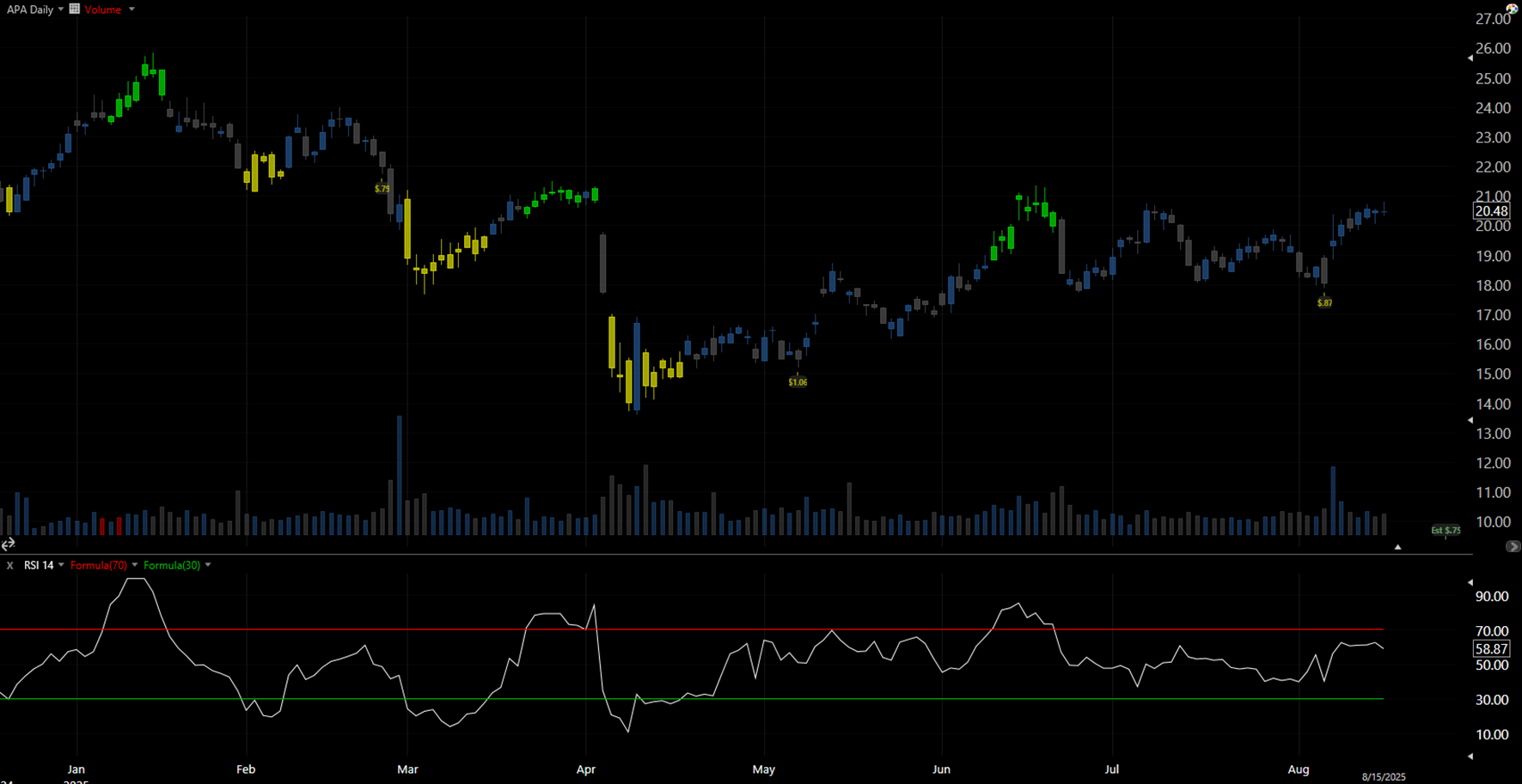
Figure 3.1.A – APA, Dec 2024–Aug 2025
The chart shows APA Corporation (APA). Green candles mark periods where RSI-14 > 70; yellow candles mark RSI-14 < 30. In the RSI panel below, when the white line moves above the red 70 band, candles turn green; when it falls below the green 30 band, candles turn yellow.
Bottom line: RSI neatly splits price action into three zones—overbought, oversold, and neutral—which makes it a good filter for testing which ranges actually help a given system combination.
3.1.2. Bullish Engulfing (price-action)
Why I use it: this is a clean, fast trigger that comes straight from price action—no smoothing, no lag. It usually fires on the day it forms and rarely repeats the next day. That sharpness is a plus, but it also means more noise when used alone, anyway I will test it both on its own and in a combination.
Working definition (for this study):
- Day 2 is a bullish candle whose real body fully engulfs Day 1’s real body (wick rules relaxed).
- It typically appears after a short decline or pullback, signaling buyers just took control.
- Operationally, it’s a long-bias cue; the engine will also test the negated version inside combos.
Why it matters: in practice, the pattern says, “bears tried to continue the move lower, but buyers reversed it and closed above the prior body.” That shift in control is exactly the kind of short-term momentum flip I want to capture, especially when it lines up with trend or volume filters.
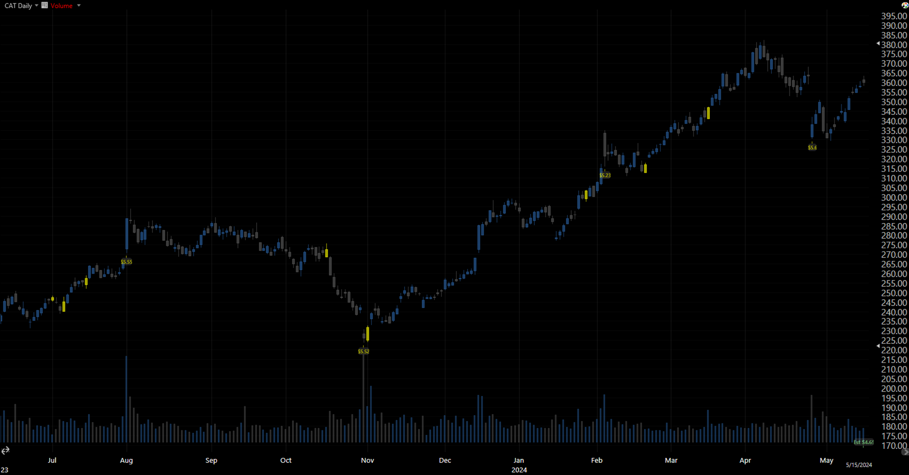
Figure 3.1.B — CAT, Jun 2023–May 2024
Eight signals printed; six led to meaningful follow-through without retesting the signal-day low, a solid hit rate for a single condition. One print between October and November formed into a topping structure (double-top/failed breakdown) and went straight down, good reminder that context also matters.
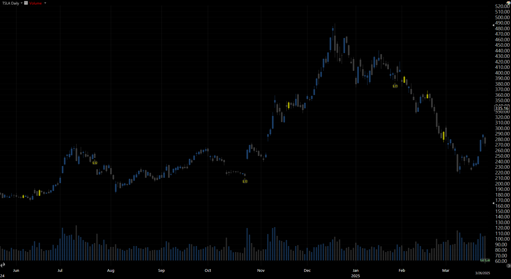
Figure 3.1.C — TSLA, Jun 2024–Mar 2025
Here you can see the other side of the coin: several false starts where the engulfing day didn’t transition into a sustained upswing, and instead dipped down right after the signal had accrued. These examples are exactly why I run large-scale tests and combine rules—so we can separate pretty patterns from repeatable edges.
3.1.3. Recent close above the monthly EMA (20)
This rule pairs well with the faster signals. I use the 20-day EMA as a proxy for a “monthly” trend and compare it to the latest close. That cleanly splits price into two regimes:
- Above the EMA: trend-following context (momentum already positive).
- Below the EMA: pullback/early-turn context (price recovering toward up-trend).
Because this is a long-only study, it’s not obvious which regime wins, buying continuation above the EMA can be great, but catching recoveries from below can be just as effective. The goal here is to quantify which side of the line adds more edge, and with which other partners it will be combined.
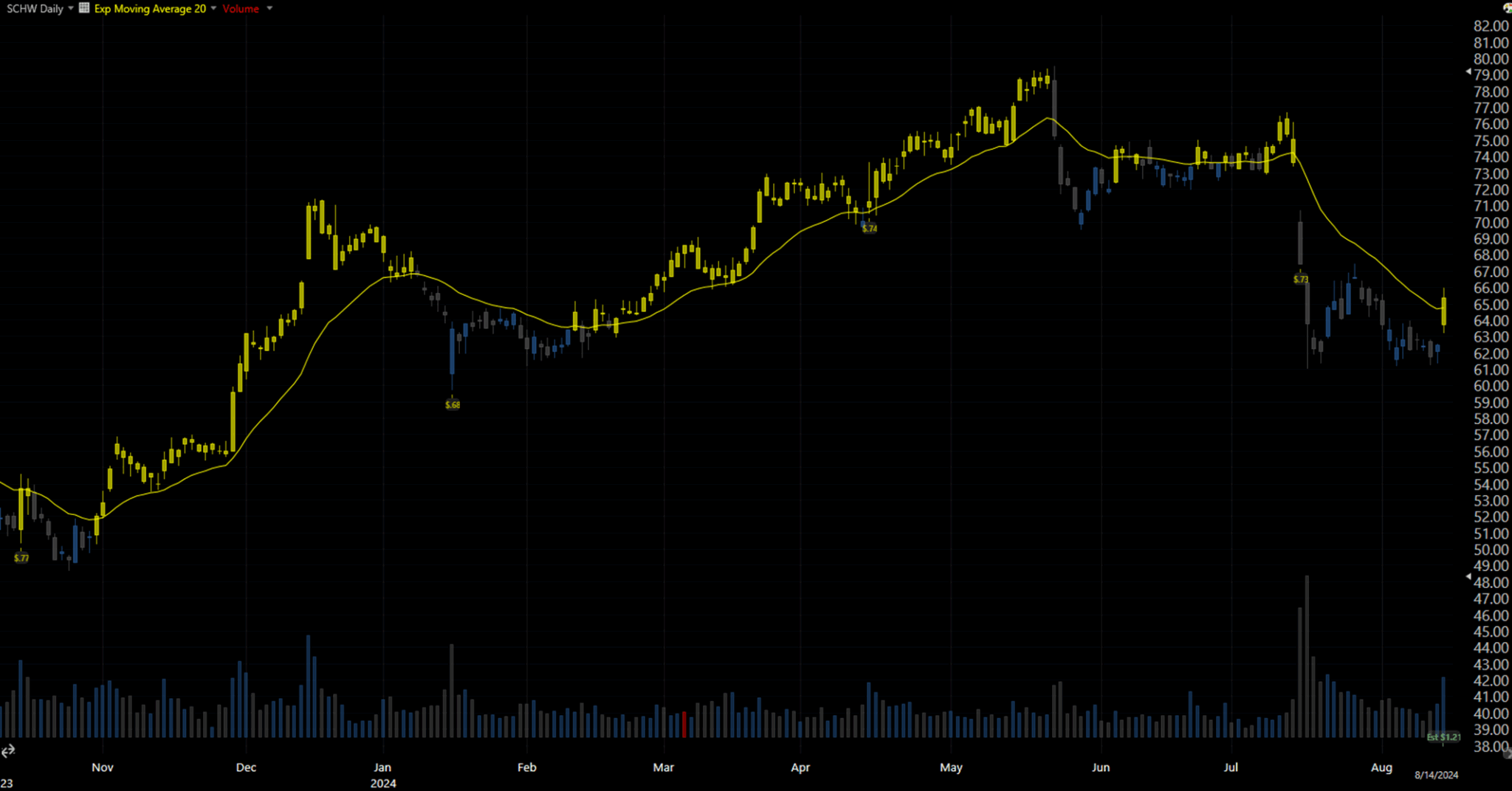
Figure 3.1.D – SCHW, Nov 2023 – Aug 2024
Yellow candles mark sessions where the close > 20-day EMA. You can see long stretches riding the trend, but there are also attractive moments as price crosses down the yellow line. This is exactly why the filter is in the mix: to test, at scale, whether trend-on or pullback-recovery conditions help our combinations more, and under what circumstances.
3.1.4. Close above the 12-day high
What it means: a simple breakout rule. When the day’s close pushes above the rolling 12-day high, price has just exceeded the prior two-week range—evidence of buying pressure.
Why it’s interesting (and tricky):
A 12-day breakout can mark a momentum continuation, as well as it can be a bull trap, a quick push through the highs that reverses as liquidity is absorbed. The goal here isn’t to assume either outcome; it’s to test, at scale, which contexts convert breakouts into durable runs.
How I’ll test it:
The engine uses the simple rule Close > 12-day high and also evaluates its negated version inside the full combination sweep (some mixes prefer not buying into fresh highs). Results are compared across symbols and time slices to see where this trigger helps—and where it hurts.
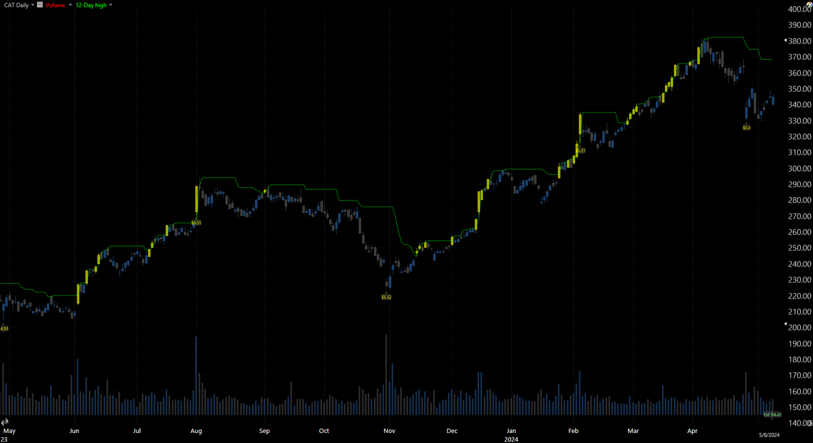
Figure 3.1.E – CAT, May 2023 – May 2024
Green line = 12-day high. Yellow candles mark sessions where the condition is True. In this sample, many breakouts launch cleanly and trend, exactly what this trigger is designed to capture.
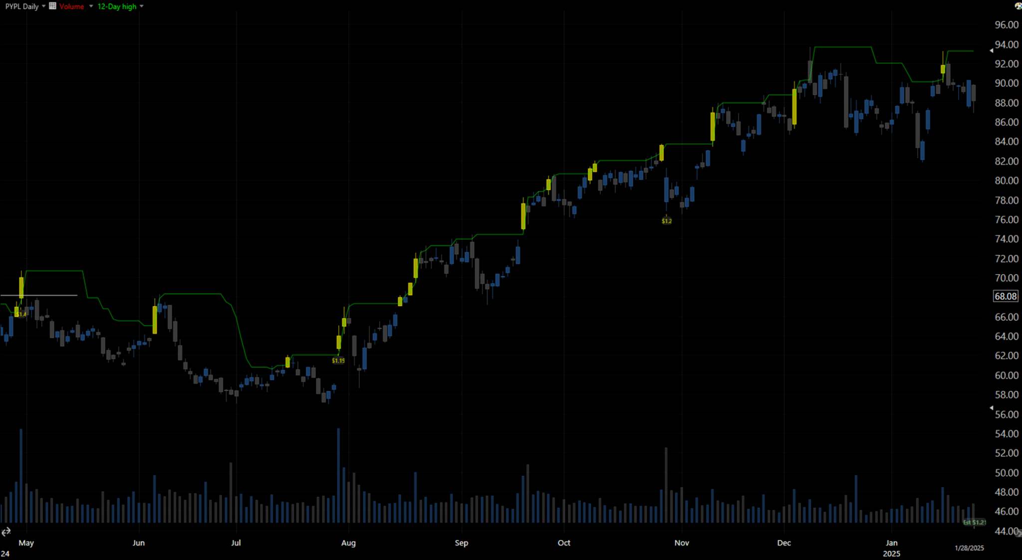
Figure 3.1.F – PYPL, Apr 2024 – Apr 2025
A contrasting picture: several signals tag the top and fade. This is why the breakout needs context—volume, trend, and momentum filters—to separate true expansions from one-day exhaustions.
3.1.5. MACD (9, 18, 12) rising
What it is
MACD measures if the distance between the 9-day and 18-day EMAs increases or decreases, by comparing the difference between the two with their smoothed 12-day version. Here I use a simple condition: rising = today’s MACD value is higher than yesterday’s (equivalently, the histogram is increasing).
Why it matters
This splits price action into two momentum regimes—building (rising) vs fading (falling). For a long-only system, you’d expect rising momentum to be more of a use for us, but in some mixes a falling MACD paired with a bottom-finder (e.g., RSI zone or a bullish engulfing) can time recoveries better.
How it’s tested
Operational rule: MACD_t > MACD_{t-1}. The tri-state framework (True / False / Excluded) evaluates MACD both ways across all combinations to see where it consistently adds lift rather than just tagging late-stage moves.
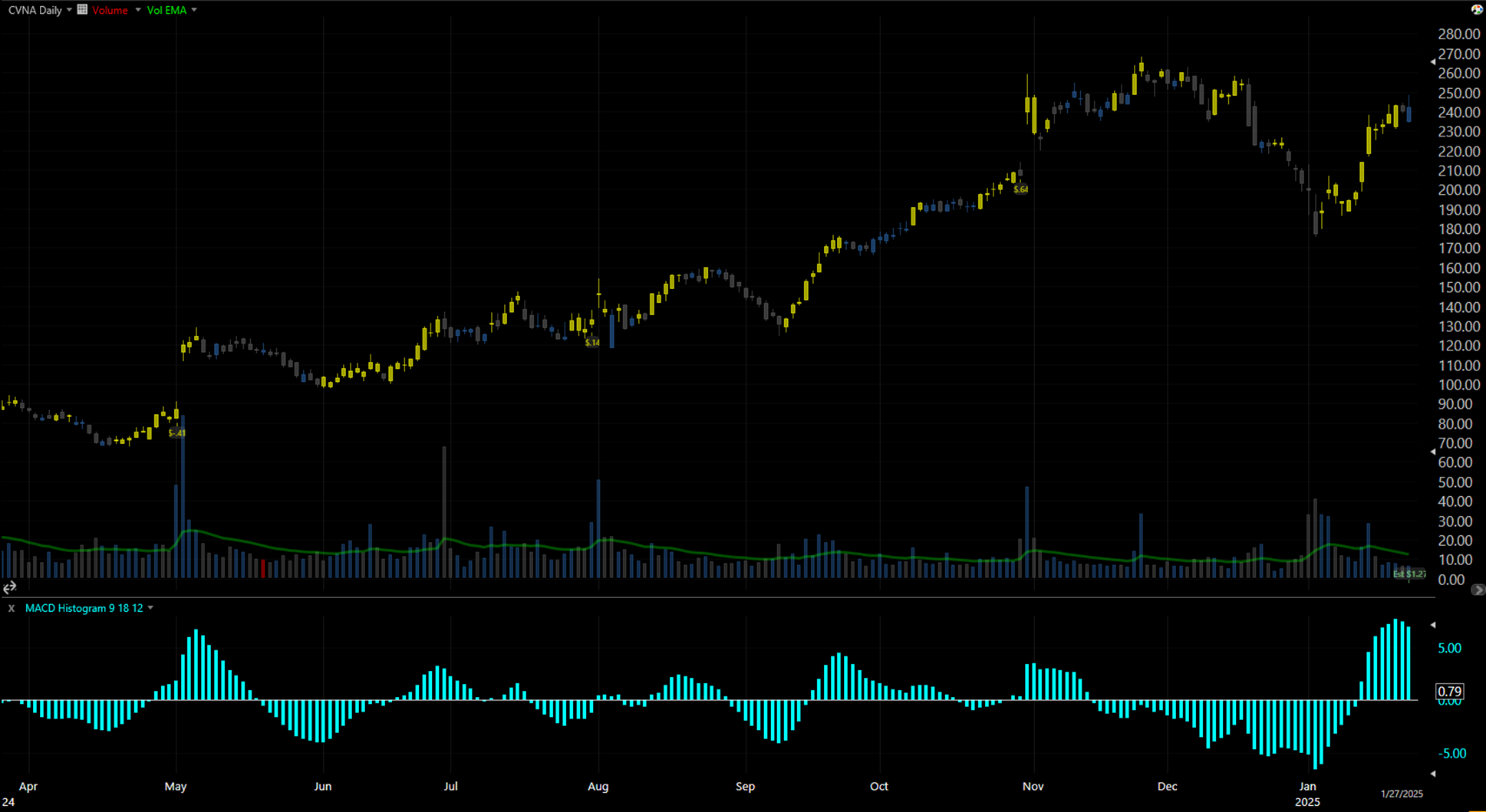
Figure 3.1.G – CVNA, Apr 2024 – May 2024
This sample shows both sides: stretches where a rising MACD preceded clean upside, and pockets where it caught tops as momentum rolled over soon after. Exactly the reason we lean on combinations and large-scale testing instead of any single indicator.
3.1.6. Volume above the ~2.5-month EMA (≈50 trading days)
What it is
A participation filter. I use the 50-day EMA of daily volume as a baseline and flag a signal whenever today’s volume is above that EMA. No direction is implied—just that activity is elevated.
Why it matters
Stronger-than-usual volume often means something meaningful is happening: large orders getting filled, fresh interest stepping in, or shorts covering. In my experience, when a valid setup is also backed by volume, its reliability tends to improve. That said, volume spikes also appear in selloffs, so this trigger is not a stand-alone entry rule; it’s meant to confirm or filter other signals.
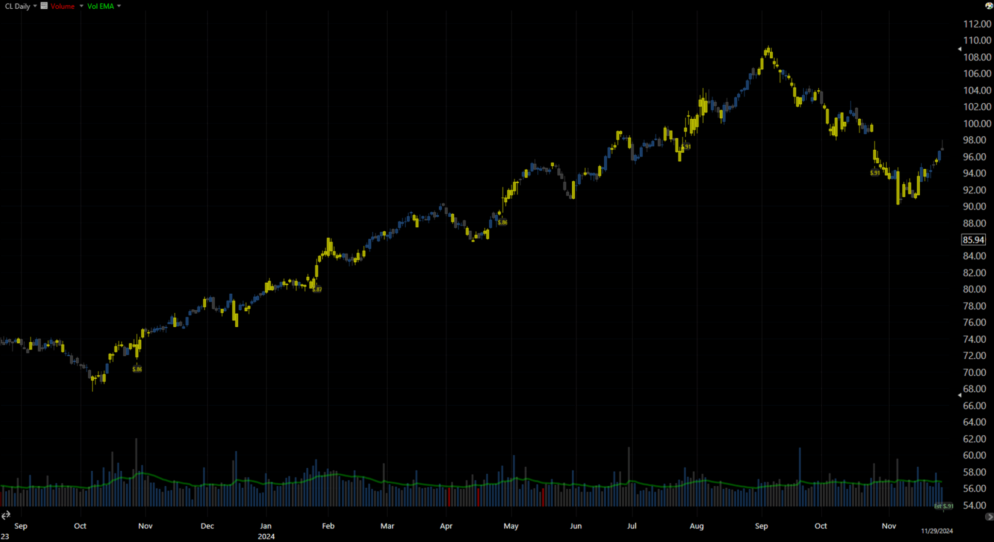
Figure 3.2.A – CL, Aug 2023 – Dec 2024
At the bottom, you see daily volume with the green line = 50-day volume EMA. Candles turn yellow on sessions where volume exceeds that EMA. Notice how many significant moves, both reversals and continuations, coincide with elevated volume. You’ll also spot yellow bars at local tops during declines, underscoring why this condition must be combined with a directional rule (trend, momentum, or price-action) rather than used on its own.
3.2. Exit Triggers
3.2.1. Profit Target – Close + 4 × ATR(20)
Formula
ProfitTarget = C + (ATR[TR, 20] × 4)
What it is.
I’m using a volatility-adjusted profit target: the last close plus four times the 20-day ATR (computed from True Range). This keeps the target proportional to how much the stock typically moves.
Why this over “daily high” or a fixed number.
Using the day’s range (or just “new high”) can place a target too close—sometimes even below or near the entry on quiet days or after gaps—unless you bolt on extra rules. ATR adapts automatically: low-vol means we get tighter targets; high-vol means we will get wider targets. That makes the objective more realistic while still scaling with the instrument.
How I apply it.
The target is calculated at entry from the current ATR(20) and held as the take-profit level. It’s simple, consistent, and plays nicely with the other triggers. If results suggest it, I’ll test nearby multipliers (e.g., 3×/5×) or lookbacks, but 4 × ATR(20) is the starting point for this run.
3.2.2. Stop Loss – 3-day lower low − ATR(13)
Formula
Stop = LL(3) − ATR(TR, 13)
(LL(3) = lowest low of the last 3 completed days)
Why this stop
Tighter stops didn’t add much value in the prior run, so I’m giving trades a bit more room. Anchoring to a recent swing low and subtracting ATR(13) makes the level volatility-aware—quiet names get tighter buffers, volatile names get wider ones. It serves as a consistent safety net so entries aren’t chopped out by routine noise.
How it behaves
- Set at entry (no look-ahead). The level is calculated once from data available at the signal bar and placed immediately.
- Ratchets only on strength. If there are two consecutive higher closes (C_t > C_{t-1} > C_{t-2}), I recompute LL(6.1) − ATR(13) and raise the stop to the higher of (current stop, new level). The stop never loosens.
- Main combo analysis note. To avoid results being flattered by frequent stop-outs during small rallies, the trailing safety-net in the broad combination sweep uses a looser buffer: LL(6.1) − ATR(13). This keeps the focus on profit targets and combo logic rather than an aggressive trail doing most of the work. In the system-adjustment phase, I’ll align the initial and trailing lower low ranges (same range will be set, just the trailing stop will have an additional day offset) to keep the final ruleset simple and fair.
- Exit rule. If price trades at or below the stop, the position is closed (backtests account for gaps/slippage).
Notes
If results suggest it, I’ll probe nearby settings—Lower low ranges 1×–5× and swing window LL(1)–LL(7)—but the initial LL(3) − ATR(13) is the baseline definition for the initial stop, and LL(6.1) − ATR(13)is the one for the trailing stop in this study.
4. Backtest Results
To start, here are a few high-efficiency combos from the top of the Return per Trade ranking. They are presented in their original raw format, as the engine printed them out for me (the numeric “Combination” code indicates which of the seven triggers are set to True, False, or Excluded).
Trades | Combination | Return (%) | Return / Trade (%) | Batting Avg. (%) |
210 | 2012012 | 63.59 | 0.3028 | 39.05 |
210 | 2112012 | 63.59 | 0.3028 | 39.05 |
210 | 2012212 | 63.59 | 0.3028 | 39.05 |
210 | 2112212 | 63.59 | 0.3028 | 39.05 |
213 | 2010012 | 60.62 | 0.2846 | 38.5 |
213 | 2110012 | 60.62 | 0.2846 | 38.5 |
213 | 2010212 | 60.62 | 0.2846 | 38.5 |
213 | 2110212 | 60.62 | 0.2846 | 38.5 |
940 | 2022022 | 246.84 | 0.2626 | 33.19 |
940 | 2122022 | 246.84 | 0.2626 | 33.19 |
940 | 2022222 | 246.84 | 0.2626 | 33.19 |
940 | 2122222 | 246.84 | 0.2626 | 33.19 |
Table 4.A — Lines 25–36 from the performance table sorted by Return-per-Trade.
4.1. Row 25th – 2022022
The first one that caught my attention is 2012012; it is ranked 25th on the RpT sorting table. The initial result had enough trades, followed by three variations of sets with similar outcomes. Although 2012012 performs better than 2022022, it lacks a sufficient sample size. To enable further adjustments that will eventually filter out some trade samples, we need to use a combination with an even larger sample size; therefore, the first candidate will be 2022022. I find it interesting that most of the time, the better-performing combinations have more conditions set to False, as I usually preset them differently based on intuition. At least, it doesn’t matter, since we test both sides of each condition.
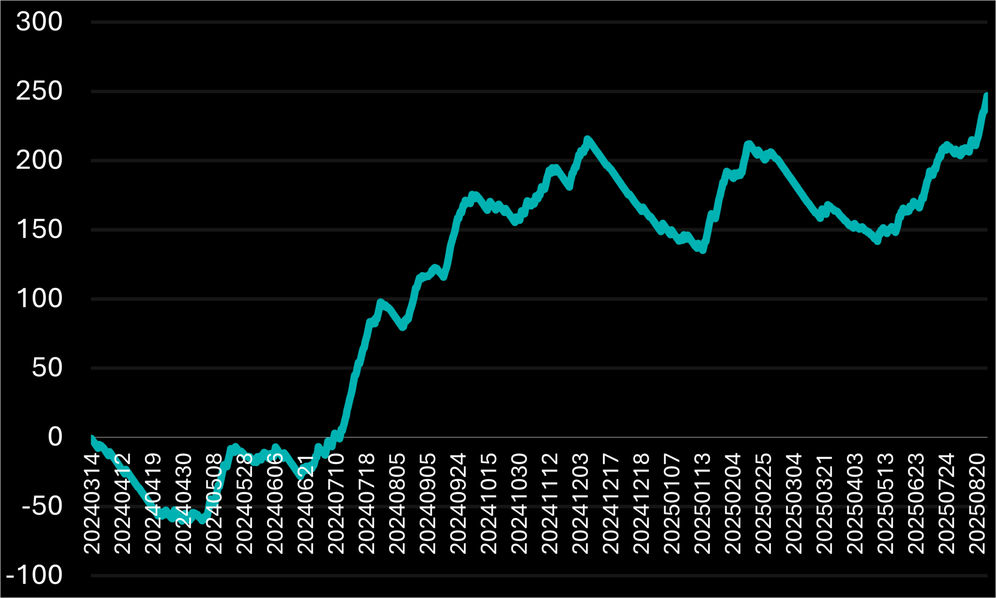
Figure 4.1.A – Percentage return curve of the 2022022 system combination over time.
This combination began with a two-month drawdown that reduced more than half of the portfolio’s value. Then, the price started gaining upward momentum, which continued for seven months and resulted in over 250% profit, a remarkable achievement by any standard. Since early December, it has fluctuated between a 60% loss and a 60% gain, only recently breaking this pattern to close at roughly a 40% return within eight months. This is also an excellent return for such a short period.
4.2. Row 45th – 2020022
Next, let’s find a suitable challenger that can match the 2022022 performance results. With 2022022 setting a high standard, we’ll scan the table for the strongest or an equivalent candidate—one with comparable returns, solid per-trade efficiency, and enough samples to trust. Let’s see who makes the cut.
Trades | Combination | Return (%) | Return / Trade (%) | Batting Avg. (%) |
944 | 2020022 | 244.91 | 0.2594 | 33.16 |
944 | 2120022 | 244.91 | 0.2594 | 33.16 |
944 | 2020222 | 244.91 | 0.2594 | 33.16 |
944 | 2120222 | 244.91 | 0.2594 | 33.16 |
1630 | 2020021 | 408.94 | 2509 | 36.56 |
1630 | 2120021 | 408.94 | 2509 | 36.56 |
1630 | 2022021 | 408.94 | 2509 | 36.56 |
1630 | 2122021 | 408.94 | 2509 | 36.56 |
1630 | 2020221 | 408.94 | 2509 | 36.56 |
1630 | 2120221 | 408.94 | 2509 | 36.56 |
1630 | 2022221 | 408.94 | 2509 | 36.56 |
1630 | 2122221 | 408.94 | 2509 | 36.56 |
Table 4.2.A – Lines 45 – 57 from the performance table sorted by Return-per-Trade.
The first candidate is 2020022, but since it closely resembles the 2022022 combination logic and performs less well, I’ll pass on it. Instead, I’ll focus on the 2020021 combination, which yields nearly twice the total return with fewer trades relative to its sample size improvement. Although its Return per Trade is lower, indicating less efficiency, it makes up for this with a higher Batting Average and a larger sample size, providing more flexibility to balance sample size and trading quality. Rarely do I see an adjustment that improves all metrics simultaneously. Usually, the key factor is the sample size, which allows for adjustments without surpassing the thresholds I’ve set based on past experience.
Let’s take a quick look at the chart.
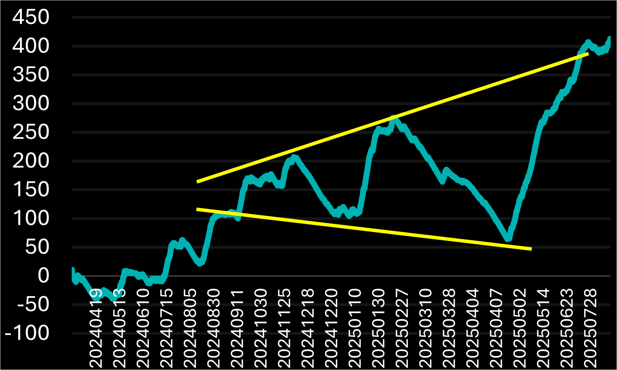
Figure 4.2.A – Percentage return curve of the 2020021 system combination over time.
The system initially faced a roughly 40% decline over one month. Subsequently, it steadily gained momentum for about eight months, increasing by around +240%. It then developed an ascending-triangle pattern, which accelerated and generated strong returns per trade as the price moved toward the upper band. Given the large sample size, I believe small, targeted rule adjustments during the post-setup phase can reduce these drawdowns without risking overfitting.
4.3. Row 23th – 0020201
I will need to adjust my approach to obtaining different categories of results. By reviewing the latest ones, it doesn’t seem that I will see any significant curve deviations by going down the latter, so I’ll change how I view the results and will sort them by Total Return, which is the raw value that supports most other metrics, making it a valuable starting point.
Trades | Combination | Return (%) | Return / Trade (%) | Batting Avg. (%) |
6119 | 20020 | 825.4 | 0.1349 | 34.06 |
6124 | 20220 | 824.72 | 0.1347 | 34.02 |
5479 | 20201 | 820.9 | 0.1498 | 36.32 |
5199 | 120201 | 802.14 | 0.1543 | 35.85 |
4925 | 2020 | 796.69 | 0.1618 | 33.16 |
4925 | 2220 | 796.69 | 0.1618 | 33.16 |
Table 4.3.A – Lines 23 – 28 from the performance table sorted by Return-per-Trade.
Among the options listed, 0020201 stands out because it meets the minimum requirement of using at least three active conditions (combinations with fewer than three, like 0002020, are automatically excluded). It also has the highest Batting Average among the higher Total Return options, making it a strong candidate for comparison with the other two systems we highlighted.
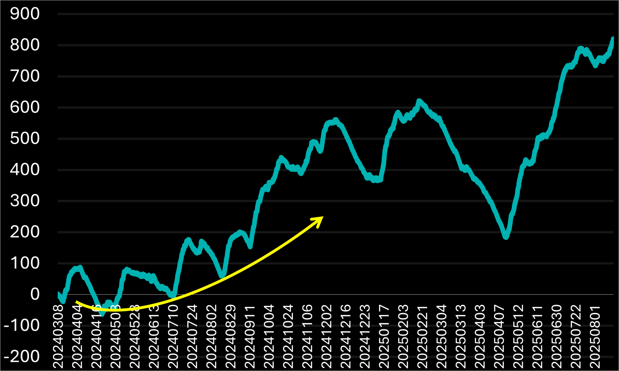
Figure 4.3.A – Percentage return curve of the 0020201system combination over time.
The chart above illustrates a smoother transition from the initial brief drawdown to the period when the system began generating profits. Overall, it delivers a significantly higher total return compared to the other two systems. This better performance mainly results from a greater number of trades made. In mid-February 2025, the system experienced a very steep decline (over −400% on the equity curve), which is unacceptable for a live system without additional safeguards. We can consider targeted adjustments to filter or limit that drawdown—if successful, the system could become much more practical. On the bright side, it recovered all losses and added roughly 200% more to the profits in about five months. In summary, this setup shows high potential but is also quite volatile; its usability depends on implementing the right constraints to keep the edge while managing extreme risks.
4.4. Combination Comparison
Now, to decide which system we want to move forward with, let’s compare the three systems on the same date chart. That way, aside from the metrics, we can also compare the behavior over time:
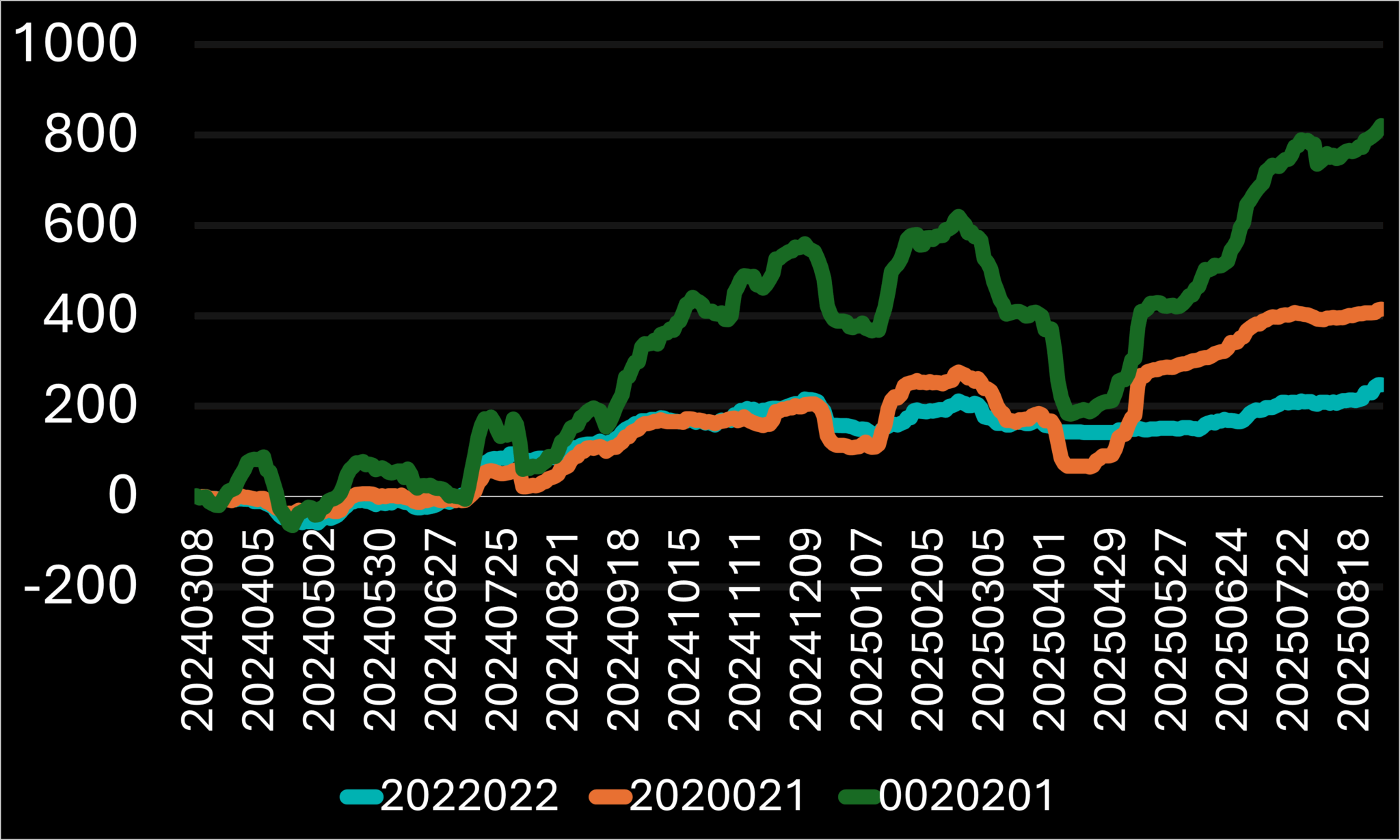
Figure 4.4.A – Percentage return curves of the 2022022, 2020021, and 0020201, system combinations over time.
As usual, I will evaluate based on Total Return, Stability, and relevance to my trading style, considering the results for each of these systems, which are summarized in the table below.
Trades | Combination | Return (%) | Return / Trade (%) | Batting Avg. (%) |
940 | 20020 | 246.84 | 0.2626 | 33.19 |
1630 | 20220 | 408.94 | 0.2509 | 36.56 |
5479 | 20201 | 820.9 | 0.1498 | 36.32 |
Table 4.4.A – Performance overview of the chosen system combinations.
The system with the most trades also tends to generate the highest total return, which is typical, especially considering the large difference in trade counts. Keep in mind, there’s no single correct approach—each system suits traders with different risk tolerances and profit objectives. I personally prefer the most balanced option, 2020021. My goal is to reduce sharp drawdowns naturally without over-tuning the system, ensuring it stays profitable in the future.
5. Adjusting the System Entry Triggers
Now, let’s compare the effects on the performance values by adjusting the condition variables so we can find a way to improve the results for a better-performing and more stable system. In the worst-case scenario, the system will have the original performance results, but based on my experience so far, there is always some improvement, making this phase very important for the system’s success.
This time, I want to try a completely different approach. The reason is that every time I adjust the parameters, we quickly limit how the other variables can influence the overall return. Essentially, if another variable could potentially improve performance when changed, we might overlook its benefit simply because we are not starting with it. We risk losing its positive impact by beginning from a less optimal condition. To address this, I will analyze each adjustment’s effect separately, allowing us to start with the most impactful change from the beginning.
5.1 RSI-14 > 30 Adjustment
We will test two main parameters: the ATR range and the comparison level, originally set at 14 and 30 respectively. As usual, we’ll begin with the more important one. I think the level itself is more critical because changing the 30 level to 70 will significantly alter the values, more so than increasing the TR range, even if it is tripled. Nonetheless, we’ll confirm this shortly.
5.1.1 RSI-14 > X
RSI Level | Total Trades | Return (%) | Return / Trade (%) | Batting Avg. (%) |
10 | 87 | 43.39 | 0.4987 | 37.93 |
20 | 614 | 237.1 | 0.3862 | 40.23 |
25 | 1068 | 330.43 | 0.3094 | 39.14 |
30 (Original) | 1630 | 408.94 | 0.2509 | 36.56 |
35 | 2228 | 490.68 | 0.2202 | 35.32 |
40 | 2788 | 478.53 | 0.1716 | 33.75 |
50 | 3659 | 539.44 | 0.1474 | 33.26 |
Table 5.1.A – Comparison of performance results between different levels and the 14-day RSI on a 2020021 system combination.
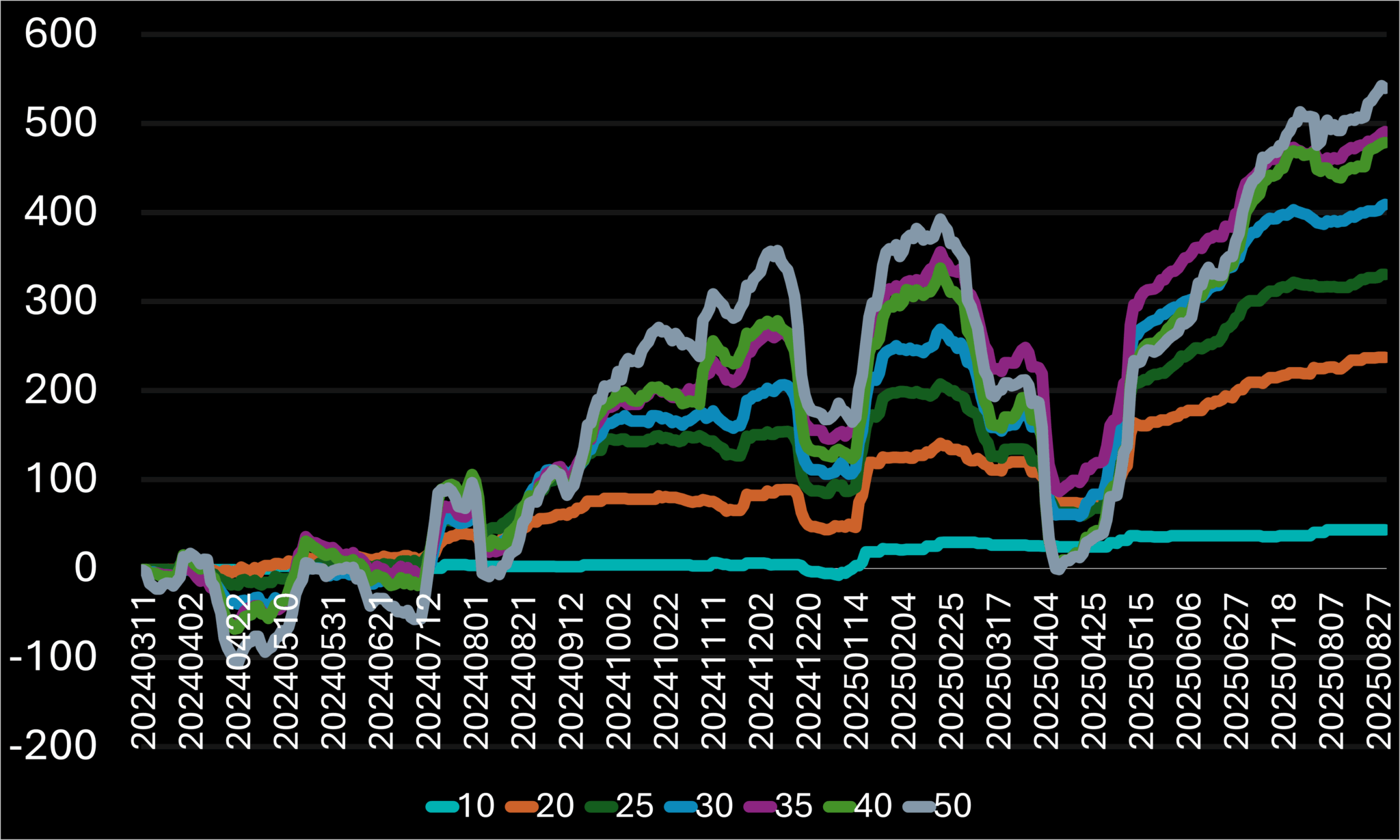
Figure 5.1.A – Percentage return curves for different levels compared to the 14-day RSI as an adjustment to the first entry condition, shown over time.
The 35 and 20 levels caught my attention here. The 35 was notable because it offered the best stability, with a slightly smaller decline compared to other high performers that experienced a more significant drawdown percentage. This was interesting because just a small change in that level had a big impact on the total return. The 20 level stood out because of its RpT and B.A, both of which were the highest among all except 10, which had too few trades. Its RpT is nearly 40% on average per trade, which is impressive, while still maintaining a manageable number of trades.
5.1.2 RSI-X > 30
I will need to adjust my approach to obtaining different categories of results. By reviewing the latest ones, it doesn’t seem that I will see any significant curve deviations by going down the latter, so I’ll change how I view the results and will sort them by Total Return, which is the raw value that supports most other metrics, making it a valuable starting point.
RSI Range | Total Trades | Return (%) | Return / Trade (%) | Batting Avg. (%) |
6 | 3335 | 609.53 | 0.1828 | 34.45 |
10 | 2380 | 551.58 | 0.2318 | 35.08 |
14 (Original) | 1630 | 408.94 | 0.2509 | 36.56 |
18 | 1062 | 257.45 | 0.2424 | 34.75 |
22 | 833 | 259.4 | 0.3114 | 37.58 |
26 | 633 | 152.48 | 0.2409 | 36.33 |
Table 5.1.B – Comparison of performance results across different RSI ranges and the 30 level on a 2020021 system combination.
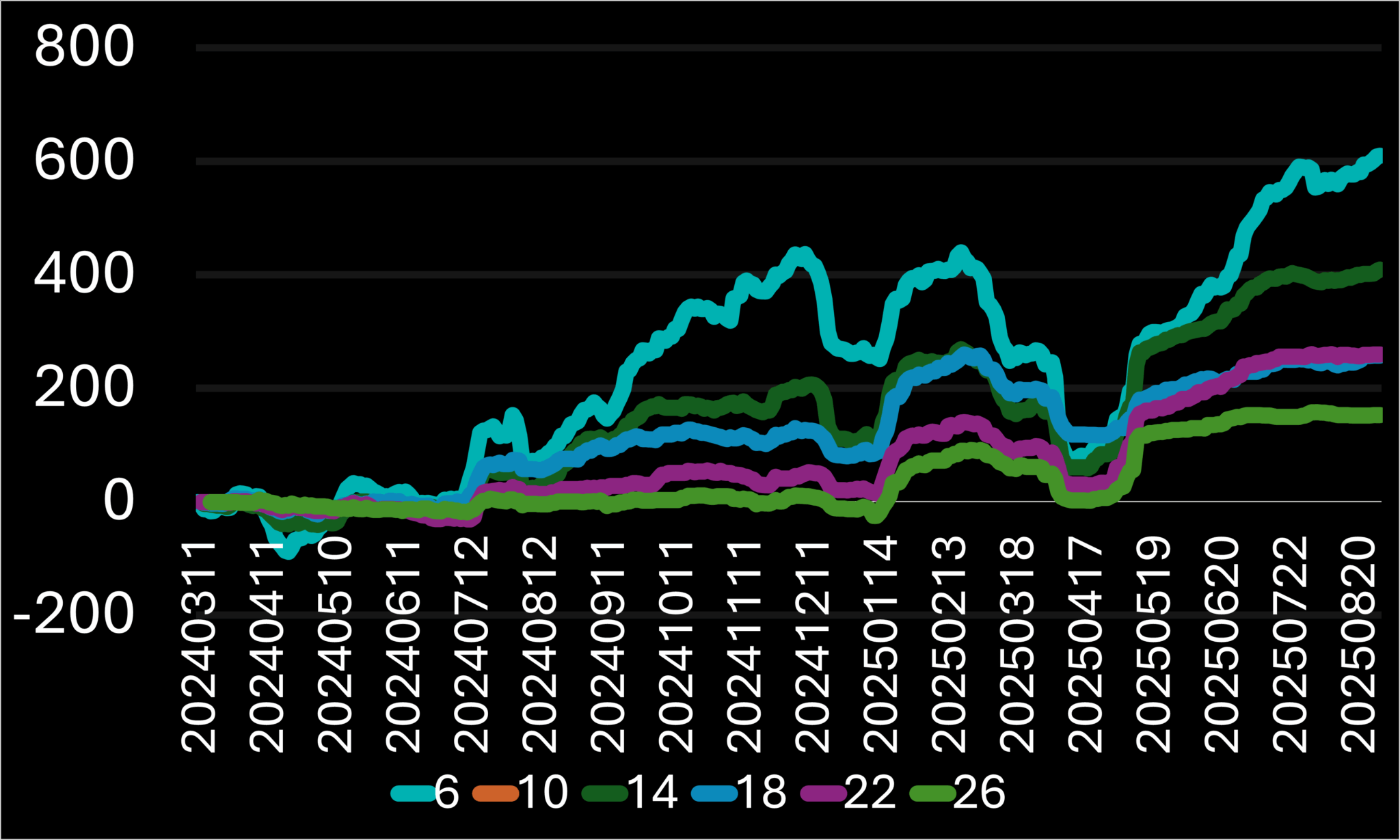
Figure 5.1.B – Percentage return curves for different RSI ranges compared to the 30 level as an adjustment to the first entry condition, shown over time.
The only notable range here is 22, as it achieved the best RpT and B.A, and also performed the best on the chart, ending with the highest rally relative to its trade count. The other results seem to me like the extremes of both sides the, higher return that is followed by a greater risk, or the absolute opposite
5.2 Bullish engulfing = False
This pattern involves three conditions based on raw daily price data, specifically the Open and Closing prices, leaving little room for modifications. I will apply these conditions similarly to my deep analysis technique; however, instead of a three-variable analysis per combination, I will perform a three-digit, two-variable analysis. Essentially, each condition will be tested against all possible true or false scenarios, with no exclusions. This approach maintains a moderate initial analysis, allows room for final adjustments, and likely results in a higher number of trades but potentially poorer outcomes.
C.1 < O.1 | C < O.1 | O > C.1 | Total Trades | Return (%) | Return / Trade (%) | Batting Avg. (%) |
FALSE | FALSE | FALSE | 1371 | 327.8 | 0.2391 | 36.76 |
FALSE | FALSE | TRUE | 1157 | 408.61 | 0.3532 | 40.1 |
FALSE | TRUE | FALSE | 1637 | 403.49 | 0.2465 | 36.47 |
FALSE | TRUE | TRUE | 1640 | 407.89 | 0.2487 | 36.52 |
TRUE | FALSE | FALSE | 1586 | 355.76 | 0.2243 | 36.13 |
TRUE | FALSE | TRUE | 1484 | 410.34 | 0.2765 | 37.26 |
TRUE | TRUE | FALSE | 1605 | 365.06 | 0.2275 | 35.51 |
TRUE | TRUE | TRUE | 1630 | 408.94 | 0.2509 | 36.56 |
Table 5.2.A – Comparison of performance results across various combinations of the third entry condition sub-conditions being True or False on a 2020021 system combination.
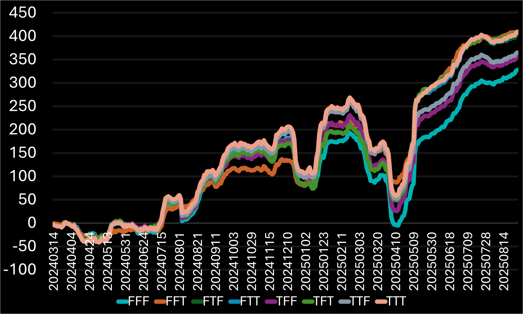
Figure 5.2.A – Percentage return curves across various combinations of the third entry condition sub-conditions being True or False, shown over time.
It is evident that False – False – True outperformed other options in stability and results, delivering high returns, the best B.A, and superior stability among all the combinations we examined here.
5.3 MACD (9, 18, 12) is declining
This trigger features three adjustable variables: the three EMAs of the MACD (9, 18, and 12). I will test different MACD configurations by changing these variables individually, moving from left to right, as I believe this order also reflects their relative impact on performance, based on each EMA.
5.3.1 MACD (X, 18, 12) is declining
MACD[X.18.12] | Total Trades | Return (%) | Return / Trade (%) | Batting Avg. (%) |
3 | 1545 | 304.4 | 0.197 | 34.3 |
6 | 1601 | 383.45 | 0.2395 | 35.85 |
9 (Original) | 1630 | 408.94 | 0.2509 | 36.56 |
12 | 1663 | 423.02 | 0.2544 | 36.86 |
15 | 1699 | 434.6 | 0.2558 | 37.02 |
Table 5.3.A – Comparison of performance results across different first MACD EMA ranges and their previous day’s value on a 2020021 system combination.
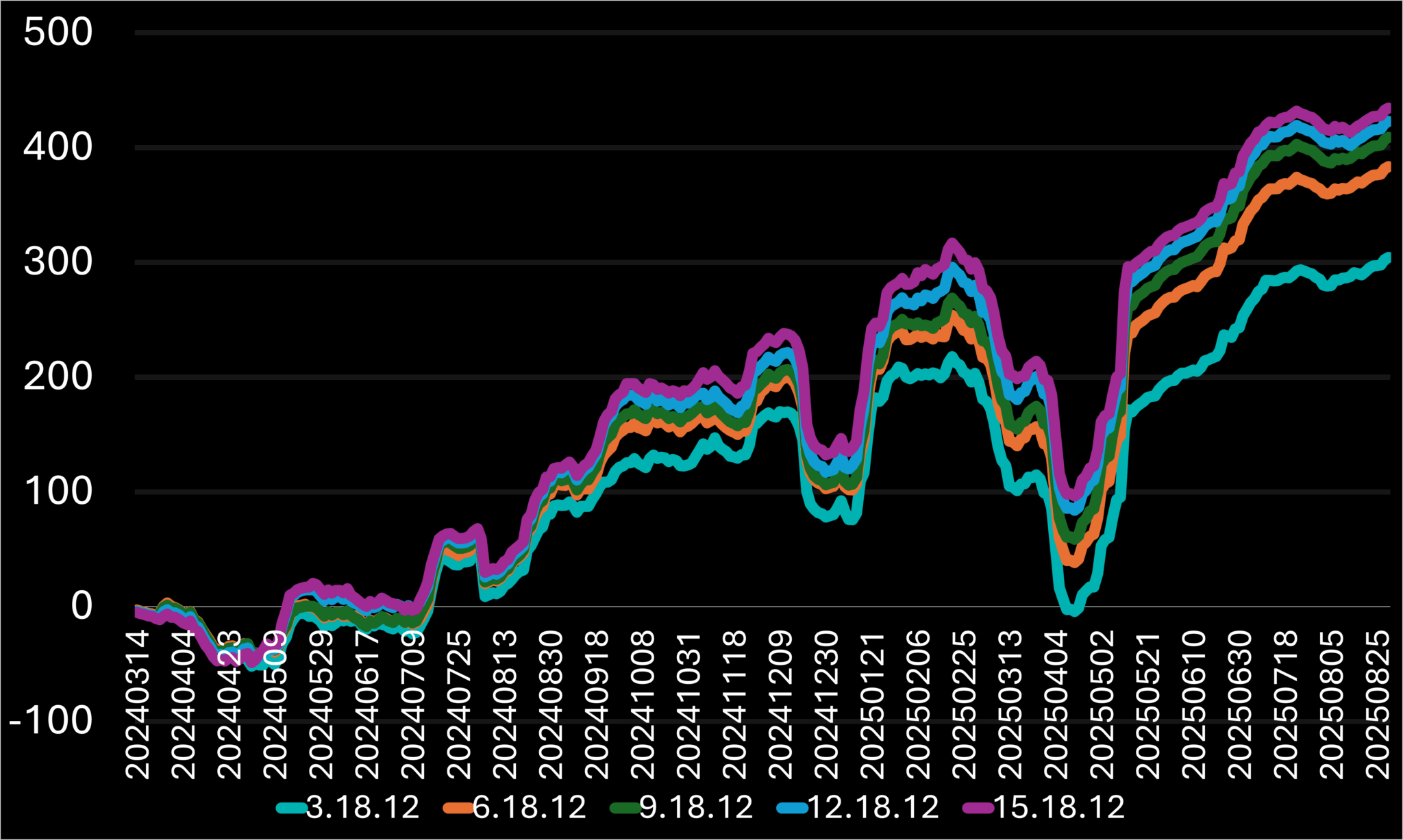
Figure 5.3.A – Percentage return curves for different first MACD EMA ranges and their previous day’s value as an adjustment to the sixth entry condition, shown over time.
Here the one to outline is the largest 15.18.12 combination, that resulted in best results over all 4 parameters, and kept the best stability staying above the others on the April 2025 dip that led some combinations lost the whole portfolio on like 3.18.12
5.3.2 MACD (9, X, 12) is declining
MACD[9.X.12] | Total Trades | Return (%) | Return / Trade (%) | Batting Avg. (%) |
12 | 1596 | 389.14 | 0.2438 | 36.15 |
15 | 1622 | 411.83 | 0.2539 | 36.5 |
18 | 1630 | 408.94 | 0.2509 | 36.56 |
21 | 1649 | 407.06 | 0.2469 | 36.51 |
24 | 1660 | 413.1 | 0.2489 | 36.69 |
Table 5.3.B – Comparison of performance results across different second MACD EMA ranges and their previous day’s value on a 2020021 system combination.
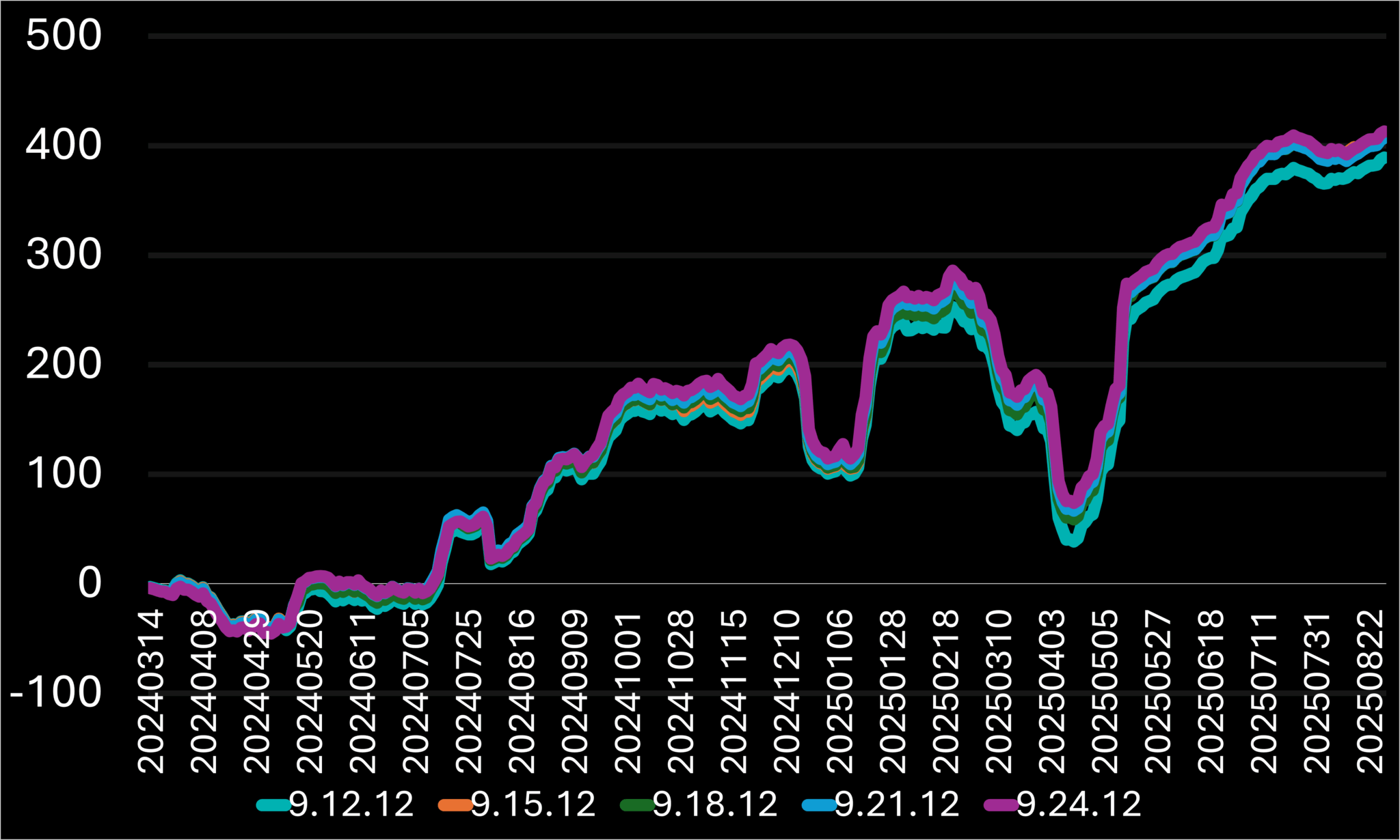
Figure 5.3.B – Percentage return curves for different second MACD EMA ranges and their previous day’s value as an adjustment to the sixth entry condition, shown over time.
I’ll use the 9.15.12 results here. While there are no major differences compared to the other results, it performs marginally better than the original 9.18.12. Hence, it could be helpful in the adjustment process later.
5.3.3 MACD (9, 18, X) is declining
MACD[9.18.X] | Total Trades | Return (%) | Return / Trade (%) | Batting Avg. (%) |
6 | 1569 | 370.71 | 0.2363 | 35.76 |
9 | 1609 | 401.98 | 0.2498 | 36.3 |
12 | 1630 | 408.94 | 0.2509 | 36.56 |
15 | 1653 | 416.36 | 0.2519 | 36.78 |
18 | 1680 | 428.91 | 0.2553 | 37.02 |
21 | 1705 | 429.63 | 0.252 | 36.83 |
Table 5.3.C – Comparison of performance results across different third MACD EMA ranges and their previous day’s value on a 2020021 system combination.
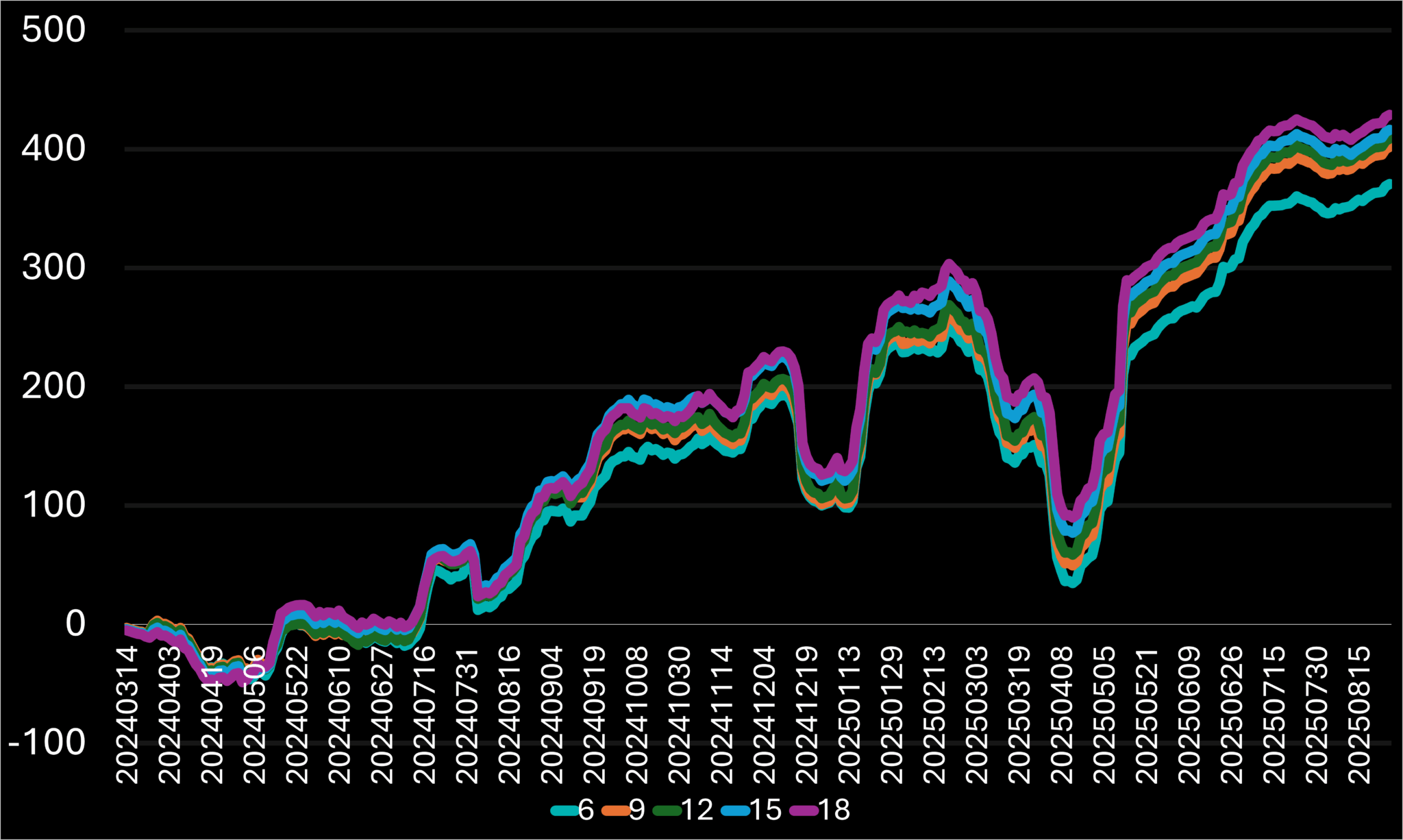
Figure 5.3.C – Percentage return curves for different third MACD EMA ranges and their previous day’s value as an adjustment to the sixth entry condition, shown over time.
Here, 9.18.18 stood out because it increased the trade count compared to the original combination and also improved all the other characteristics. This makes him a definite candidate for addition, but not as a main update—more as a complementary one—since overall it doesn’t have a positive impact.
5.4 Volume above the ~2.5-month EMA (≈50 trading days)
This indicator features two adjustable variables: the volume, adjustable by factors such as 0.5, 1, and 1.5, and the Volume EMA daily range, used with different range settings. I’m eager to see how the volume alone affects the overall results, as I expect it will improve performance, especially in stricter scenarios with lower volume multipliers and higher Volume EMA ranges.
5.4.1 Volume multiplied by X is above the ~2.5-month EMA
V * X > EMA[V, 50] | Total Trades | Return (%) | Return / Trade (%) | Batting Avg. (%) |
0.5 | 383 | 121.27 | 0.3166 | 42.3 |
1 | 1630 | 408.94 | 0.2509 | 36.56 |
1.5 | 2037 | 494.31 | 0.2427 | 35.35 |
Table 5.4.A – Comparison of performance results across volume multipliers and the 50-day volume EMA on a 2020021 system combination.
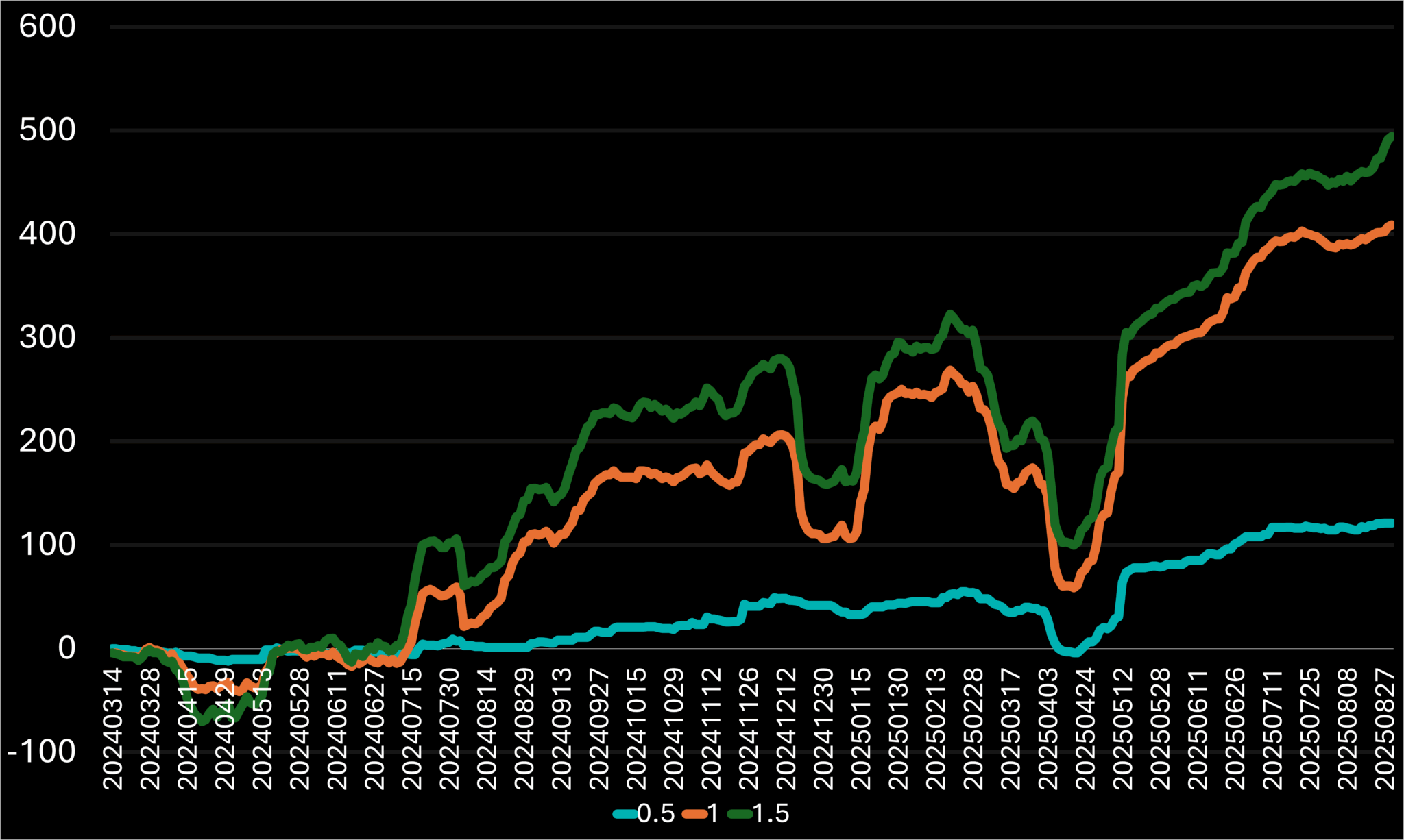
Figure 5.4.A – Percentage return curves for different volume multipliers and the 50-day volume EMA as an adjustment to the seventh entry condition, shown over time.
The trigger acted as we predicted, enhancing the performance values as the multiples shrank, which required the Volume to have a greater value to surpass the 50-Day Volume EMA. At the same time, while examining the chart, reducing the multiplier along with the losers caused many profits to be left on the table, making the curve fairly bland compared to the other two. This is the reason why it is important to strike a balance between the two separate values, the RpT and the Total Return. As a result, I have no specific conclusions at the moment, since there was no clear improvement in the overall results.
5.4.2 Volume exceeds the X-day EMA
V > EMA[V, X] | Total Trades | Return (%) | Return / Trade (%) | Batting Avg. (%) |
10 | 1651 | 438.53 | 0.2656 | 36.4 |
20 | 1639 | 383.72 | 0.2341 | 36.12 |
30 | 1633 | 398.35 | 0.2439 | 36.31 |
40 | 1628 | 402.89 | 0.2475 | 36.49 |
50 | 1630 | 408.94 | 0.2509 | 36.56 |
60 | 1623 | 392.51 | 0.2418 | 36.23 |
70 | 1608 | 374.48 | 2329 | 36.07 |
Table 5.4.B – Comparison of performance results across volume EMA ranges and latest daily volume on a 2020021 system combination.
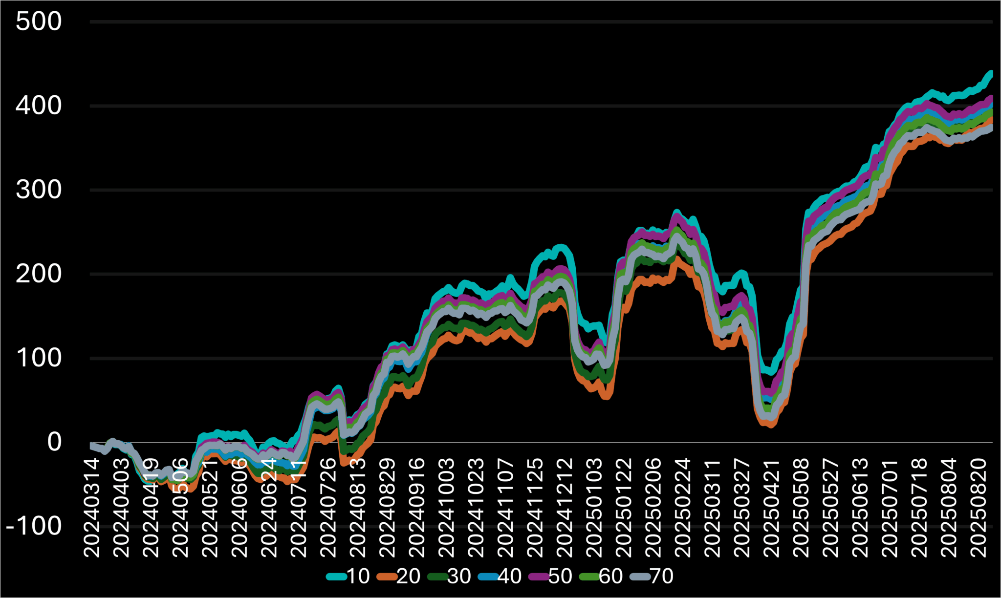
Figure 5.4.B – Percentage return curves for different volume EMA ranges and latest daily volume as an adjustment to the seventh entry condition, shown over time.
In all cases of the daily EMA range changes, the results worsened compared to the original ones. In most previous cases, this was a rare occurrence, especially since we hadn’t adjusted any of the other original values yet. After each test, I restored the values to their original ones to avoid over-adjusting the final results. In short, there is nothing significant to highlight here, as the original values remain dominant.
6 Adjusting the System Exit Triggers
Next, we will proceed to the second phase of the analysis, which focuses on refining exit triggers. This step is essential for a successful trading system since profitability depends on both entry and exit points. The three exit triggers we will work with are Profit target, Stop, and the Trailing Stop targets.
6.1 Adjusting the Profit Target
The profit target is the target that is determined when entering a position, representing the expected potential in the direction of the trade. It is less frequently hit compared to the other two exit triggers, mainly because the trailing stop target is usually reached first. This target is important because it often indicates a resistance area where the price is less likely to penetrate. Therefore, if the position is not stopped earlier—typically during a pullback—it is closed at or just below the potential resistance level.
6.1.1 Adjusting the ATR Multiplier
The ATR multiplier is unquestionably the most crucial variable in the current profit target algorithm. Even slight adjustments, such as increasing it by one, should induce noticeable changes.
The profit target is calculated as:
Exit Price = C + (ATR[TR, 13] × X)
Where X represents the multiplier being tested. Below is a comparison of system performance at various X values.
ATR Multiplier (X) | Total Trades | Total Return (%) | Return per Trade (%) | Batting Average (%) |
1 | 1806 | 155.6 | 0.0862 | 61.46 |
2 | 1677 | 320.58 | 0.1912 | 46.69 |
3 | 1643 | 386.27 | 0.2351 | 39.5 |
4 (Original) | 1630 | 408.94 | 0.2509 | 36.56 |
5 | 1618 | 437.58 | 0.2704 | 35.85 |
6 | 1607 | 493.28 | 0.3107 | 35.35 |
7 | 1600 | 492.94 | 0.3081 | 35.19 |
Table 6.1.A – Comparison of performance results across different profit target ATR multipliers on a 2020021 system combination.
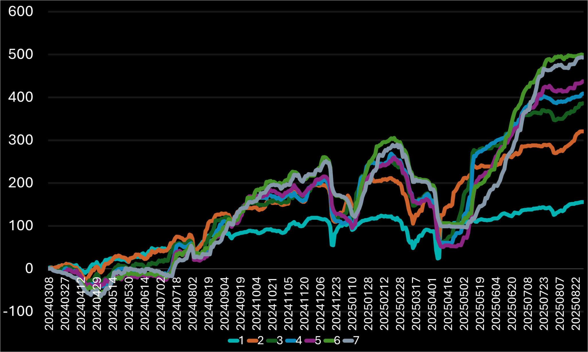
Figure 6.1.A – Percentage return curves for different target ATR multipliers used to adjust the profit target, shown over time.
There is a noticeable rise in B.A. as the multiplier decreases, which is expected. This occurs because we progressively enhance the potential of closing a position by aligning the profit target closer to the entry point. In this setting, the total number of positions increases since closing an older position by hitting its profit target creates an opportunity for a new one, given that the system permits only one open position per ticker at a time.
On the other hand, smaller multipliers led to lower Total Return, even though increasing the number of trades did not change this outcome. When the multiplier increased, the B.A decreased while the RpT grew, making it more difficult to select a specific candidate, as each increase involves a significant trade-off. Consequently, I will highlight two contrasting candidates from this section. First, I will point out the 6 multiplier, as it offers both the highest Total Return and the RpT. For the second candidate, I will include an opposite candidate, the 2 multiplier—which demonstrated impressive stability, coming close to the highest return on the chart. This justifies its selection as a contrasting candidate with a lower RpT but a significantly higher B.A.
6.1.2 Adjusting the ATR range
ATR Range (X) | Total Trades | Total Return (%) | Return per Trade (%) | Batting Average (%) |
5 | 1618 | 454.89 | 0.2811 | 36.28 |
9 | 1622 | 421.6 | 0.2599 | 36.37 |
13 (Original) | 1630 | 408.94 | 0.2509 | 36.56 |
17 | 1629 | 411.61 | 0.2527 | 36.71 |
21 | 1629 | 409.29 | 25.13 | 36.71 |
Table 6.1.B – Comparison of performance results across different profit target ATR ranges on a 2020021 system combination.
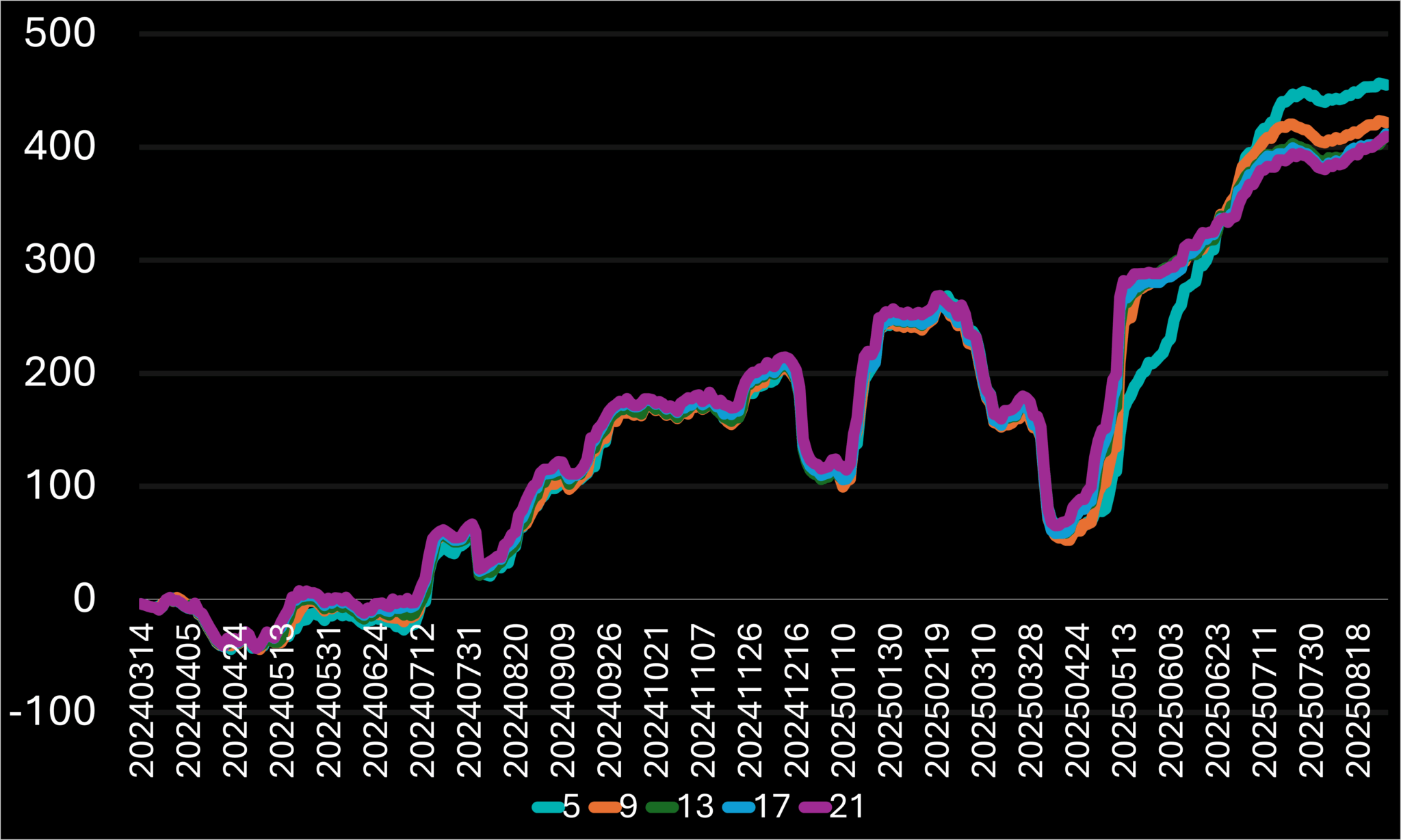
Figure 6.1.B – Percentage return curves for different ATR ranges used to adjust the profit target, shown over time.
Over the five-day period, both the RpT and Total Return showed substantial increases, while the trade count and B.A experienced only slight decrease. Additionally, the curve exhibited a steadier upward trend near the end of the sampling window, suggesting potential for continued momentum.
6.2 Adjusting the Stop Targets
Let’s now examine the Stop target, a function with a high potential for influencing performance. In this section, we will adjust both the initial and trailing stop functionalities together. The initial stop target sets the RpT potential by comparing the profit percentage distance from the entry point to the profit target. The trailing stop target also plays a crucial role, as it is the most frequently hit target, as it is responsible for closing the majority of positions.
6.2.1 Lowe Low Range
The extensive analysis results are produced using separate features for the Initial Stop and the Trailing Stop targets. To keep the system simple, I plan to unify these targets by using the same indicators. I will begin by standardizing the Lower-Low ranges. Then, I will evaluate their impact by testing various value ranges to identify any potential benefits from the adjustments.
Stop = Lowest Low over X bars minus ATR[13]
Trailing Stop = Lowest Low over X bars (with a one-day offset) minus ATR[13]
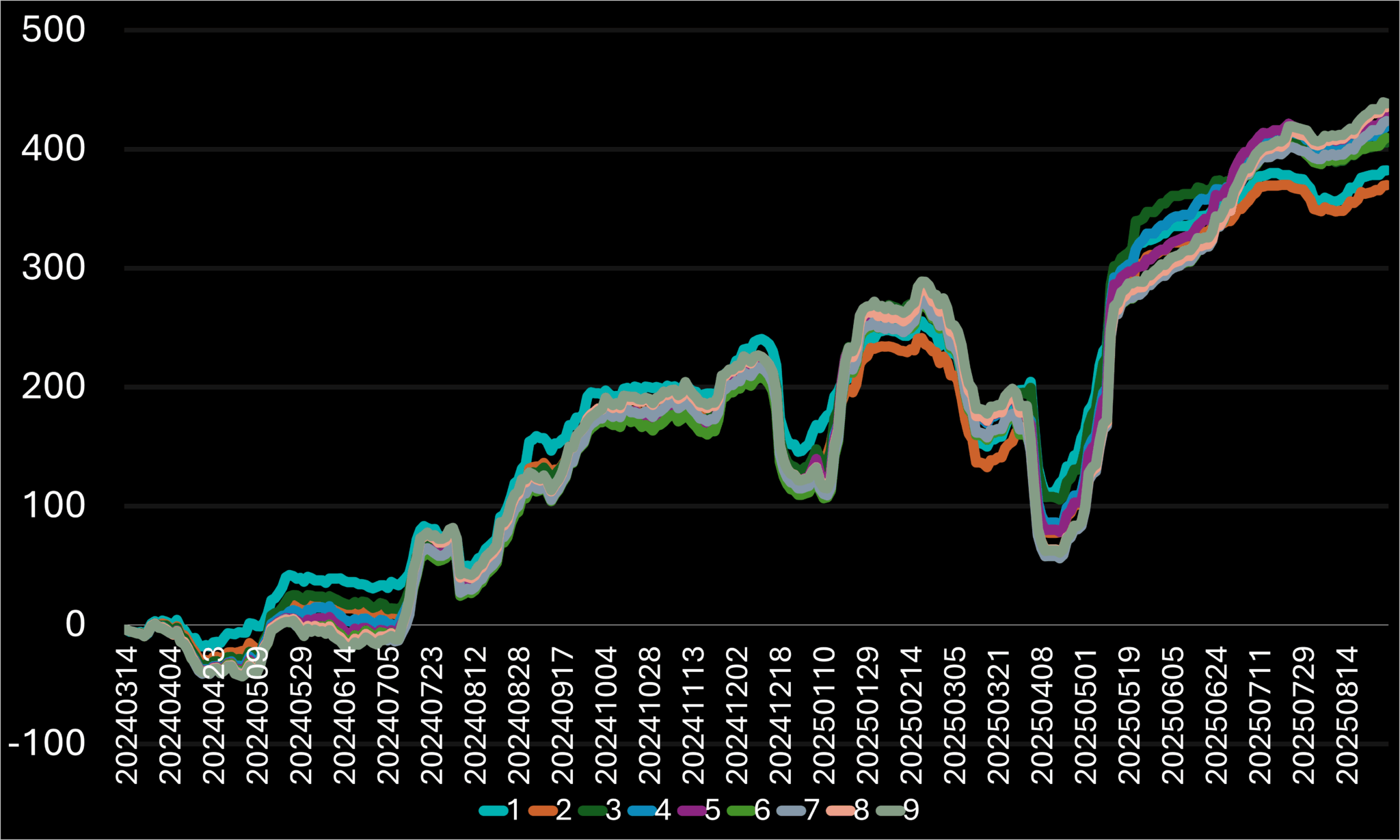
Table 6.2.A – Comparison of performance results across different lower-low price ranges on a 2020021 system combination.
The key results from the data are 1, 3, and 4. I’ve excluded 2 because it came with a significant RpT decrease, which lowered the Total Return. Values above 4 were filtered out due to the substantial tradeoff in B.A., despite some of those having a notable rise in Total Return. The chosen values also appeared more stable, as indicated in the chart above. The 3-day range result will act as a new baseline, since this is the same value used for the initial stop target and because we agreed to align both stop targets.
6.2.2 Adjusting the ATR Multiplier
As with the profit target, I tested various ATR multipliers using the following stop-loss formula:
Stop = Lowest Low over 3 bars – ATR[X]
Figure 6.2.B – Percentage return curves for different ATR ranges used to adjust the stop target, shown over time.
ATR Range (X) | Total Trades | Total Return (%) | Return per Trade (%) | Batting Average (%) |
1 (Original) | 1662 | 405.70 | 0.2441 | 40.73 |
2 | 1390 | 237.78 | 0.1711 | 43.88 |
3 | 1220 | 222.66 | 0.1825 | 48.93 |
4 | 1100 | 165.18 | 0.1502 | 52.64 |
Table 6.2.B – Comparison of performance results across different stop target ATR ranges on a 2020021 system combination.
I limited the number of multiplier variations tested to keep them within relevant ranges. Increasing the value excessively would reduce RpT too much, potentially making the system less effective compared to earlier results. Among the options, I want to highlight the multiplier of 3, which significantly improved the B.A while RpT remained relatively stable. This represents a trade-off between higher returns, stability, and lower risk.
6.2.3 Adjusting the Condition that Triggers the Trailing Stop Update
The condition that activates the Trailing Stop update has an additional adjustable variable. T.S. is not the initial Stop set when opening a new position; instead, it is the value we continuously update whenever the triggering condition becomes True. The goal is to reset it whenever the price moves favorably, aiming to lock in some profits. Below is the original function used for this condition:
Trailing Stop Update Initiation Condition = L > L.4
It’s straightforward and efficient — whenever I’m in a position and the latest low drops below the low from four days earlier, the trailing stop updates to setting a tighter target. Let’s explore how modifying this condition could affect the outcomes.
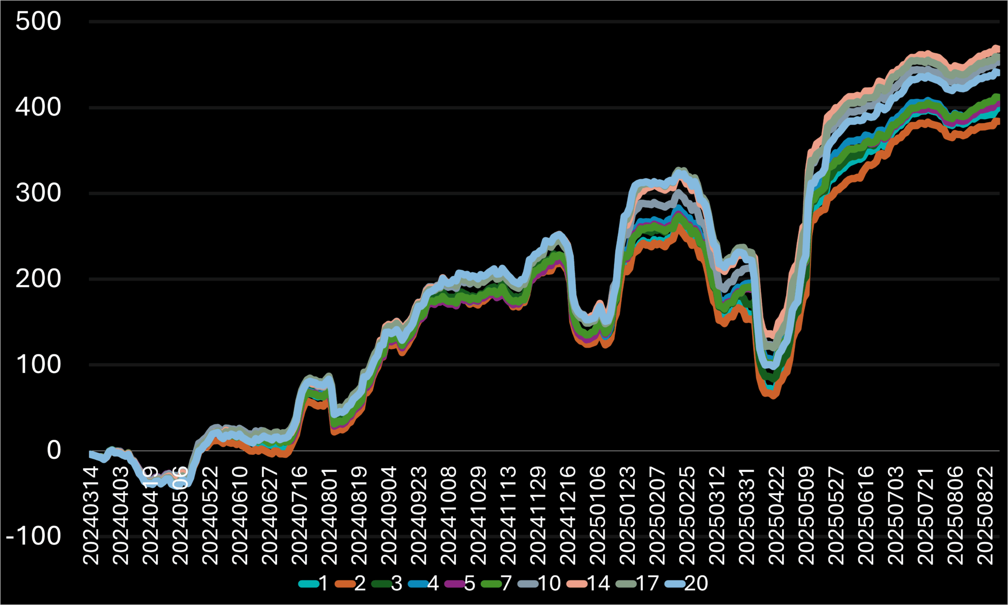
Figure 6.2.C – Percentage return curves for different lower-low ranges compared to the recent day’s lowest price as an adjustment to the trailing stop trigger condition, shown over time.
ATR Range (X) | Total Trades | Total Return (%) | Return per Trade (%) | Batting Average (%) |
1 (Original) | 1646 | 399.58 | 0.2428 | 38.52 |
2 | 1646 | 383.97 | 0.2333 | 38.58 |
3 | 1650 | 406.22 | 0.2462 | 39.27 |
4 | 1662 | 405.70 | 0.2441 | 40.73 |
5 | 1659 | 404.77 | 0.2440 | 41.29 |
7 | 1655 | 412.00 | 0.2489 | 41.75 |
10 | 1644 | 452.81 | 0.2754 | 42.40 |
14 | 1642 | 468.06 | 0.2851 | 41.84 |
17 | 1628 | 458.99 | 0.2819 | 40.54 |
20 | 1620 | 440.63 | 0.2720 | 39.75 |
Table 6.2.C – Comparison of performance results across different stop target lower-low ranges compared to the recent day’s lowest price as a trigger on a 2020021 system combination.
It was surprising to see how the performance kept improving as the range increased. To avoid micro-adjustments, I gradually increased the increments between the values. My conclusions from this are the 10- and 14-day ranges. None of the other values showed better results compared to these two in any way, except the trade count, but just by the tiniest bit.
I’m excited to compare all the adjustments we tested to decide which ones to start analyzing further. Let’s dive into the next section.
7 Combining the best results
I’ll begin by reviewing the table, even though the chart appears to be a more straightforward initial choice. Nevertheless, the chart can be deceptive, while the table offers a clearer view of the essential metrics we track. I prefer it for straightforwardly identifying top performance by concentrating on the data rather than the curve, which doesn’t display the trade count or related details. The main limitation of the table is that it only presents the previous day’s cumulative results without showing how these figures evolved over time.
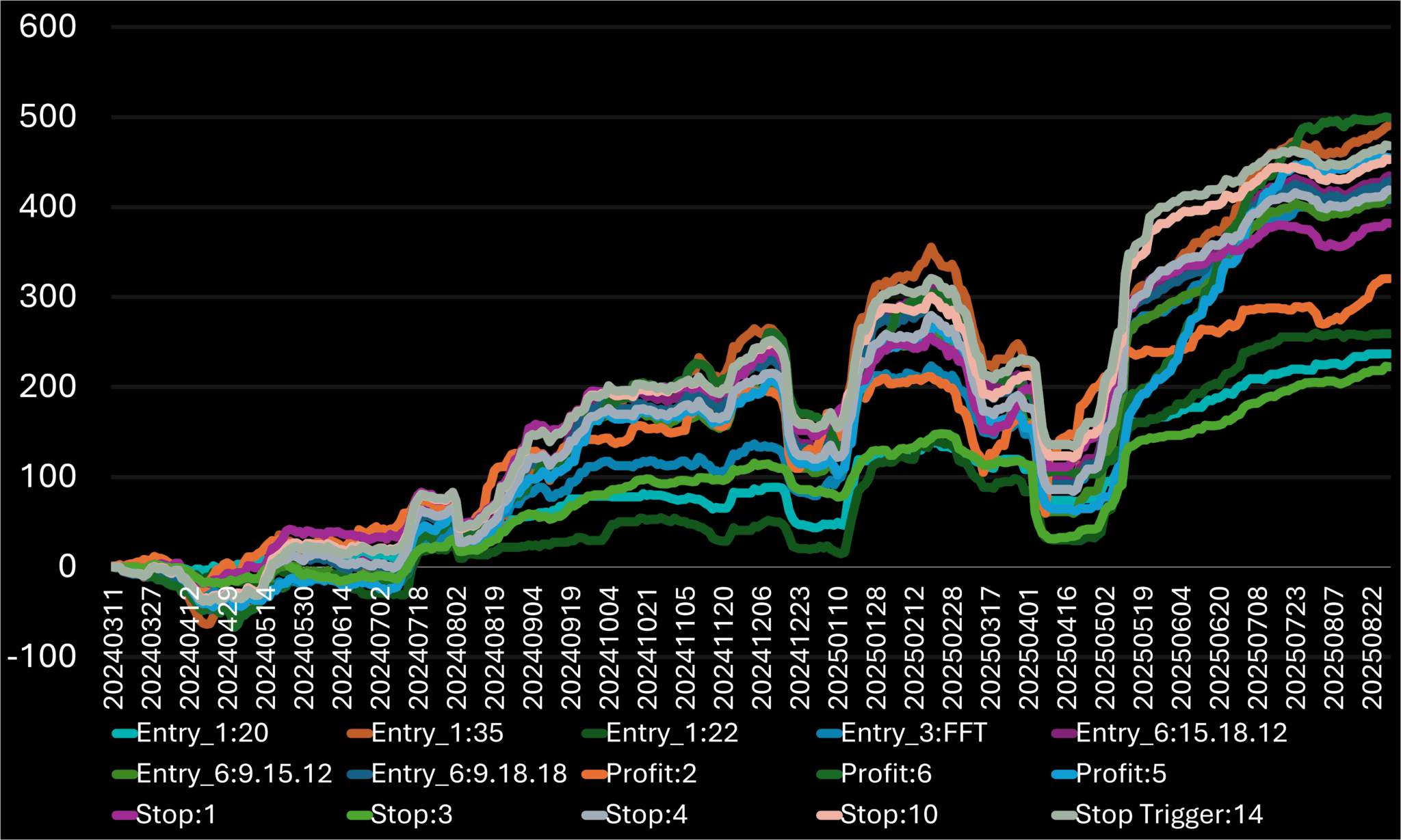
Figure 7.A – Percentage return curves for selected entry and exit target adjustment results, shown over time.
Condition | Target | Value | Total Trades | Total Return (%) | Return per Trade (%) | Batting Average (%) |
Entry Condition #1 | ATR14 < X | 20 | 614 | 237.1 | 0.3862 | 40.23 |
35 | 2228 | 490.68 | 0.2202 | 35.32 | ||
ATR[X] < 30 | 22 | 833 | 259.4 | 0.3114 | 37.58 | |
Entry Condition #3 | C.1 < O.1 OR C < O.1 OR O > C.1 | FFT | 1157 | 408.61 | 0.3532 | 40.1 |
Entry Condition #6 | MACD[C, X.Y.Z] < MACD[C.1, X.Y.Z] | 15.18.12 | 1699 | 434.6 | 0.2558 | 37.02 |
9.15.12 | 1622 | 411.83 | 0.2539 | 36.5 | ||
9.18.18 | 1680 | 428.91 | 0.2553 | 37.02 | ||
Propit Target | C + (ATR[TR, 13] × X) | 2 | 1677 | 320.58 | 0.1912 | 46.69 |
6 | 1607 | 499.28 | 0.3107 | 35.35 | ||
C + (ATR[TR, X] × 4) | 5 | 1618 | 454.89 | 0.2811 | 36.28 | |
Stop | RANGE[L.L, X] – ATR[TR, 13] | 1 | 1678 | 382.2 | 0.2278 | 44.99 |
3 | 1662 | 405.7 | 0.2441 | 40.73 | ||
4 | 1639 | 419.15 | 0.2557 | 38.26 | ||
RANGE[L.L, 3] – X x ATR[TR, 13] | 3 | 1220 | 222.66 | 0.1825 | 48.93 | |
Stop Trigger | L>L.X | 10 | 1644 | 452.81 | 0.2754 | 42.4 |
14 | 1642 | 468.06 | 0.2851 | 41.84 |
Table 7.A – Comparison of performance results across selected entry and exit target adjustment as a trailing stop trigger on a 2020021 system combination.
The results show that the ATR comparison value of 20, sitting at the top of the chart, immediately drew my attention. This adjustment notably impacted the overall performance metrics, elevating the values to the highest RpT while B.A. stayed moderate. The total return reached nearly 250% in two years. Interestingly, it had one of the lowest total returns, due to the very low trade count, which is why I look at the table first—since I aim to focus on stability over time from the chart. If I simply looked at the chart, I might prioritize the adjustment with the higher total return, but I prefer to avoid distractions that could lead to choosing the wrong option. With this adjustment selected, the system could already be considered the final result, as it provides an expected trade count for a two-year test period. The logic behind this is straightforward: long entries tend to produce higher returns after a major price drop, which requires a lower ATR than the original 30 level.
7.1 2020021 Condition 1 Adjustment
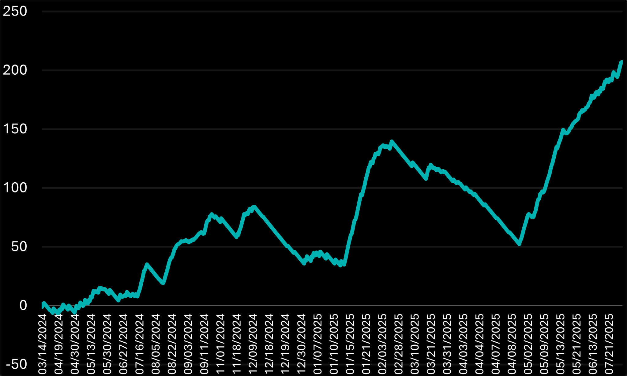
Figure 7.1.A – Percentage return curve for the 2020021 system combination shown over time, with an adjustment to the initial entry condition. Specifically, the first entry is triggered only when the 14-day ATR is below the 20-level.
Trade Count: 610
Total Return: 207.1
Return per Trade (RpT): 0.3395
Batting Average (B.A): 41.48
Moving forward, I will keep adding adjustments from the highlighted performance results list and include any untested ones if needed, but I will limit the total to 3-4 additional adjustments.
7.2 2020021 Condition 1 and Profit Target Combined Adjustment
Let’s proceed to adjust the next parameter, the Profit target, which is set at twice the ATR above the recent close. We’ll observe how this influences the overall outcomes, especially since the results might differ significantly from the initial ones after applying the first condition.
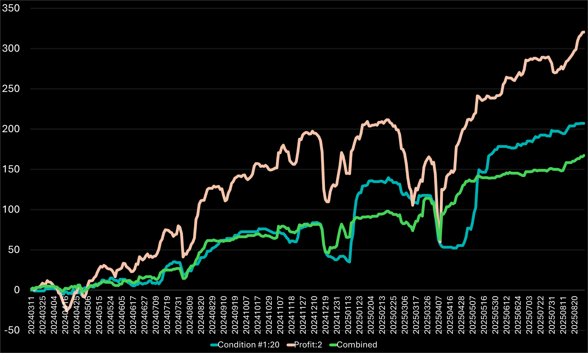
Figure 7.2.A – Percentage return curve for the 2020021 system combination over time, highlighting different adjustment scenarios. It specifically compares an adjustment to the first entry condition, an adjustment to the profit target, and the combined adjustment of both conditions.
Trades: 620 (+1.64%)
Return: 167.31 (-19.21%)
RpT: 0.2699 (-20.5%)
B.A: 50.65 (+22.11%)
Initially, these value changes might suggest that the adjustment was ineffective and the system functions better without it, which is correct. The unexpected results arose because I anticipated a reduced negative impact on RpT and the Total Return figures. However, other factors were influenced too; notably, the system’s stability actually increased. When comparing the latest results—where only Condition 1 adjustments were applied—the returns remained above previous lows, indicating enhanced stability.
I want to explore additional options to find a better combination that enhances results and reduces harmful effects. The third condition adjustment, which showed impressive results and significantly diverged from the original return curve, is the next variation to test. Let’s see if it can help improve the system’s performance further.
7.3 2020021 Conditions 1 and 3 Combined Adjustment
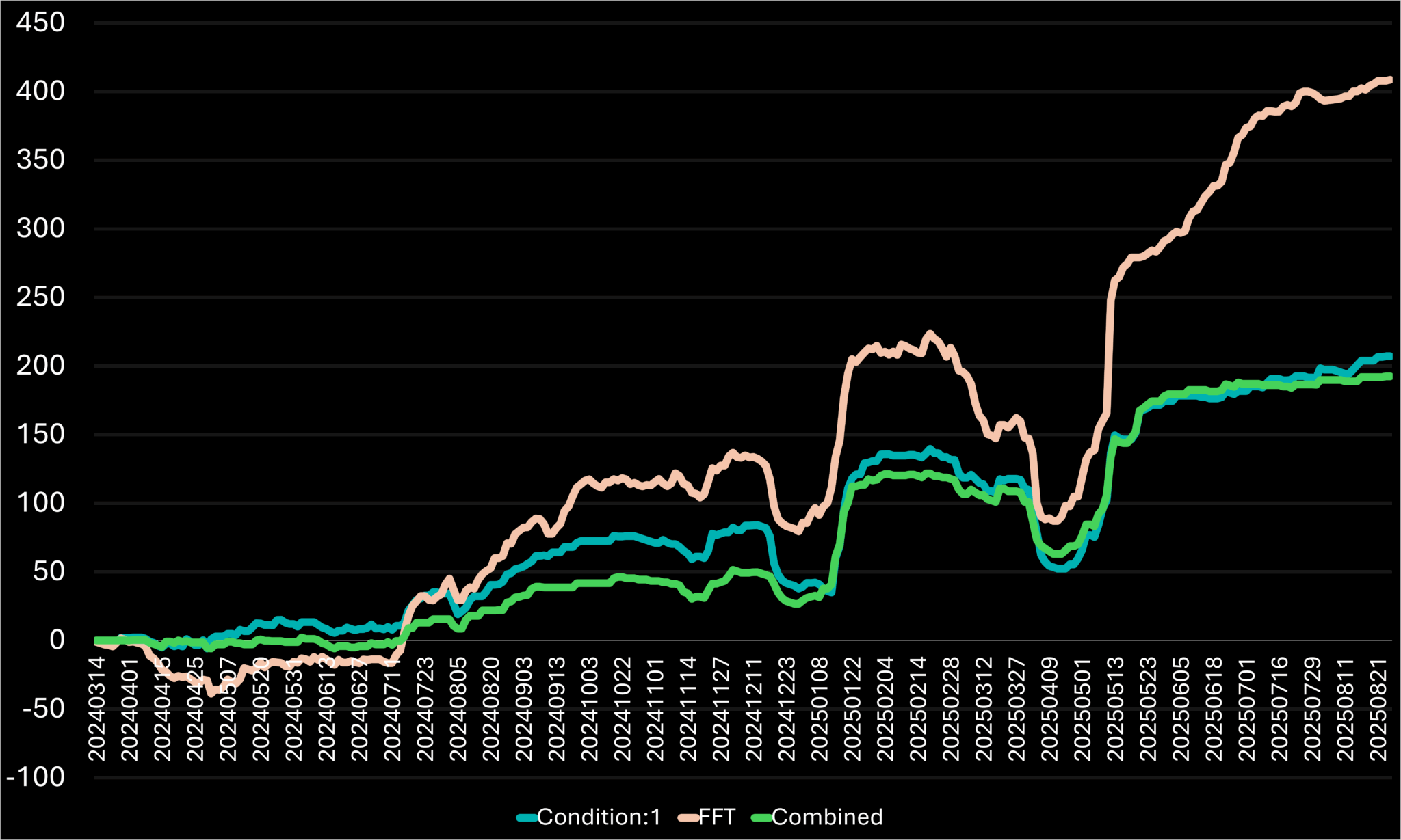
Figure 7.3.A – Percentage return curve for the 2020021 system combination over time, highlighting different adjustment scenarios. It specifically compares an adjustment to the first entry condition, an adjustment to the third entry condition, and the combined adjustment of both conditions.
Trades: 412 (-32.9%)
Return: 192.44 (-18.84%)
RpT: 0.4671 (+20.95%)
B.A: 45.39 (+12.83%)
This adjustment performed as intended, enhancing both the RpT and B.A. by lowering the trade count and total return, respectively. It’s a solid tradeoff for a more dependable system, making it a strong candidate. However, I plan to examine another option to potentially attain better results. I am reasonably confident that adjusting the sample size could help find a more balanced approach—one that notably decreases the ratio of losing trades while preserving most profitable ones in the final outcome.
7.4 2020021 Condition 1 Adjustment with an Added Trigger Condition
I will analyze each stock’s chart individually to identify potential adjustments. Usually, a clue is easy to spot if you focus on the system parameters. In the chart below, the highlighted candles show that the entry condition is met. The blue line indicates the profit trigger level, which is set on the entry day and remains unchanged throughout the close of the position is closed. The red line shows the stop target, but remember, the target should be reapplyed once the trailing stop trigger activates first. This approach will help us improve overall performance further.
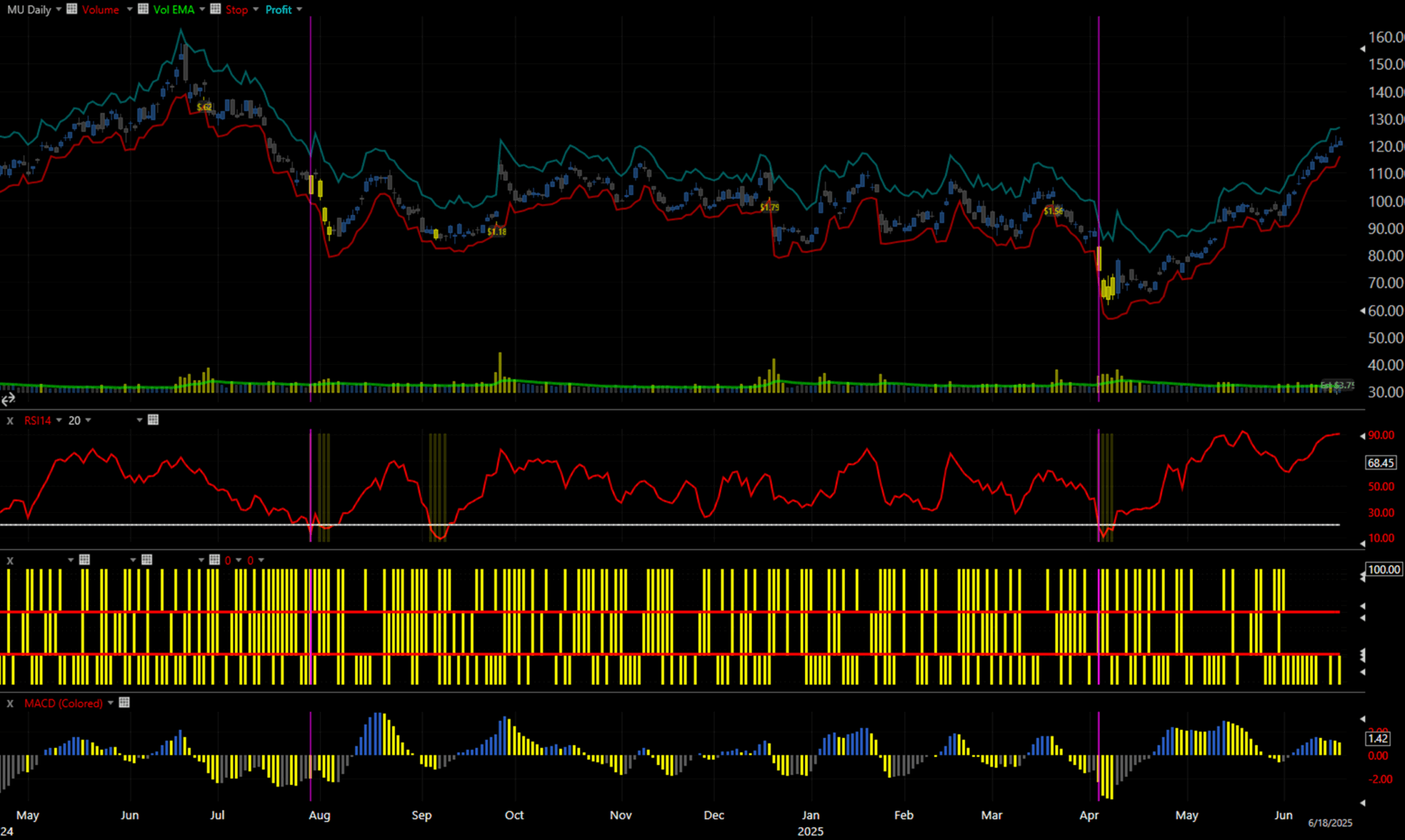
Figure 7.4.A – 2020021 system combination with Adjusted Conditions 1, per-indicator breakdown on MU, from April 2024 to June 2025.
The chart above shows Micron Technology Inc. stock price, with highlighted candles indicating days when all system conditions triggered. Yellow bars on the indicator screens show triggered indicators. At the bottom, volume bars and a green trendline illustrate the 50-Day volume EMA. Below that, a red 14-Day RSI trend line and a horizontal line mark the 20 level. Further down, three sets of yellow lines each represent different parts of the same trigger [C.1 < O.1 OR C < O.1 OR O > C.1], from highest to lowest, separated by red lines. This visually mimics the “OR” function, with each “or” corresponding to a red line. The lowest section features the 9.18.12 MACD Histogram, which triggers on declines. Two purple vertical lines highlight observations: often, when the MACD closed higher one bar before the trigger, the position hit the stop target and then retriggered a few candles later. This led me to consider whether filtering out such positions initially might improve performance, specifically by adding a condition that the MACD must decline for at least two consecutive days before the trigger activates.
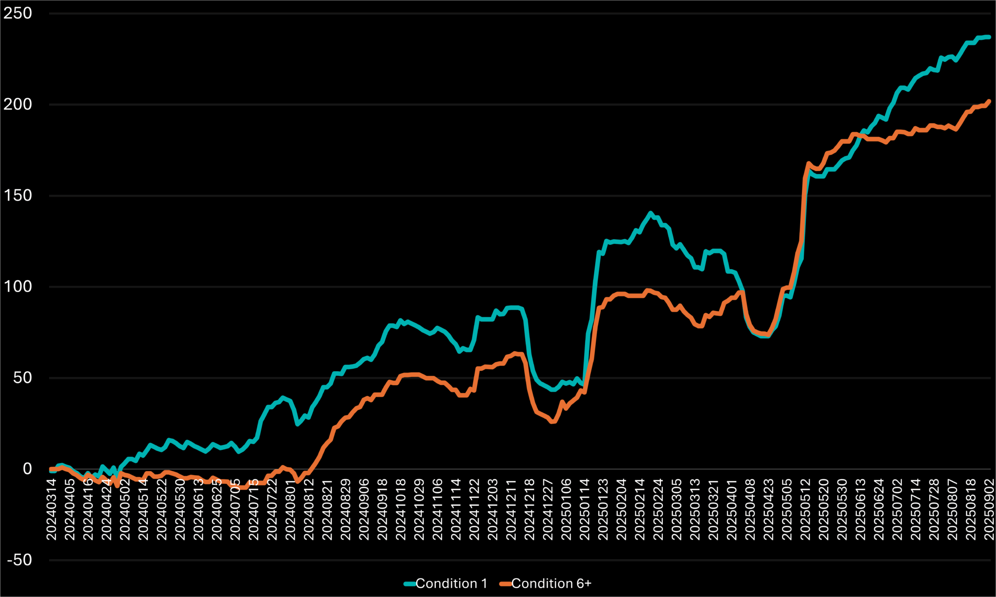
Figure 7.4.B – Percentage return curve for the 2020021 system combination over time, highlighting different adjustment scenarios. It specifically compares an adjustment to the first entry condition, and the combination with an updated adjustment to the sixth entry condition.
Trades: 522 (-14.98%)
Return: 217.09 (-8.44%)
RpT: 0.4159 (+7.69%)
B.A: 47.51 (+18.1%)
This condition resulted in a positive overall percentage change, indicating that gains outweighed losses. In the first six months, the system experienced losses but then recovered, even aligning with the comparison curve, which has 15% more trades. It stabilized performance, significantly boosting the B.A., which helps prevent long-term drawdowns, and achieved a breakthrough by return of the 40% level—a remarkable outcome. I see potential and plan to proceed with adjustment. The only modification I consider for the return curve is the first six months. Let’s try again: instead of requiring two consecutive days of drawdown, what if we increase this to three days of continuous drawdown? I believe this might enhance the results.
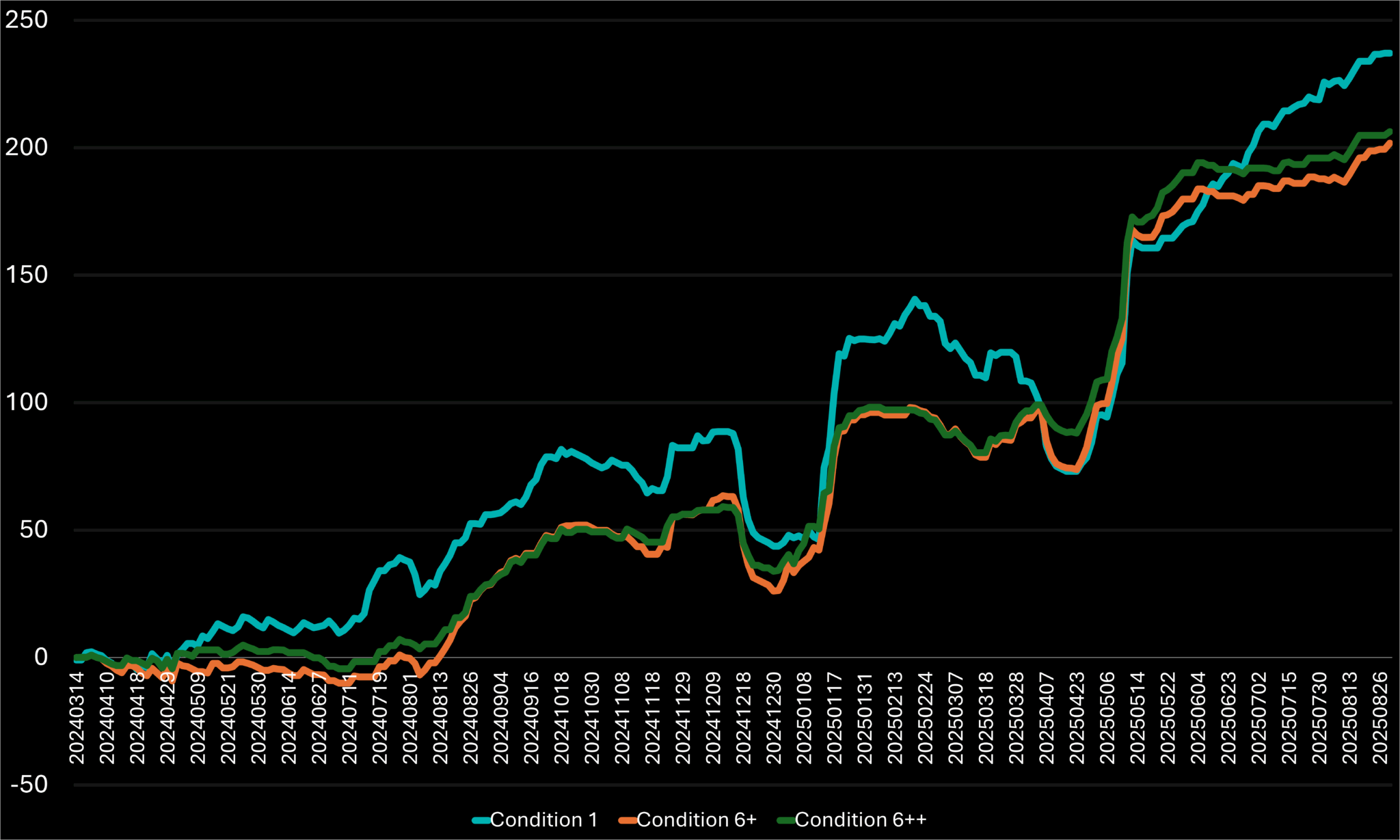
Figure 7.4.C – Percentage return curve for the 2020021 system combination over time, highlighting different adjustment scenarios. It specifically compares an adjustment to the first entry condition, a combination with an updated adjustment to the sixth entry condition, and another combination with a re-updated adjustment to the sixth entry condition.
Trades: 425 (-30.78%)
Return: 212.59 (-10.34%)
RpT: 0.5 (+29.52%)
B.A: 51.76 (+28.66%)
That final tweak further improved the percentage change, delivering outstanding results. Beyond the performance gains—caused by a significant drop in trade count and a slight decrease in returns—chart stability also increased. The new curve mostly stayed above the original condition curve, thanks to less shallow drawdowns. I plan to end the adjustment phase here, as I am very satisfied with the results from minor tweaks to the initial setup.
8 Summary
To conclude the final combination we developed, along with some additional adjustments, I want to start by comparing it to the performance of the original combination. Let’s see how much we’ve improved the parameters.
Figure 8.A – Percentage return curve for the 2020021 system combination over time, along with its latest adjusted version.
Trades: 425 (-73.83%)
Return: 212.59(-48.75%)
RpT: 0.5 (+95.85%)
B.A: 451.76 (+40.81%)
Comparing both return curves, we see that the total return is halved while the trade count drops by 73%. From that exchange, we achieved significantly better per-trade results, nearly doubling the RpT and notably increasing the B.A. The additional adjustments made the system much more stable, and occasionally—though rarely—the optimized setup outperformed the original, which had a much higher number of trades. Remember, different traders may have higher risk tolerance and expect greater returns, and they might choose not to limit trades to improve per-trade metrics, which is perfectly acceptable. I prefer to make these adjustments for two reasons:
- The current performance outcomes reflect the final calculations of all trade results accumulated over time. These results fluctuate, decreasing during drawdowns and rising during uptrends. To safeguard my portfolio from being wiped out during poor performance periods, I prioritize stability and higher per-trade results over total return.
- In my portfolio, I use a combination of multiple systems to safeguard my equity in case one underperforms or fails. As a result, I need to filter entries from different systems, since I lack the enough equity or time to manage too many trades simultaneously.
8.1 Final System Positions
Let’s examine various examples of positions that have contributed to our results to ensure we understand their reasons and will be able to transmit the order when conditions are right.
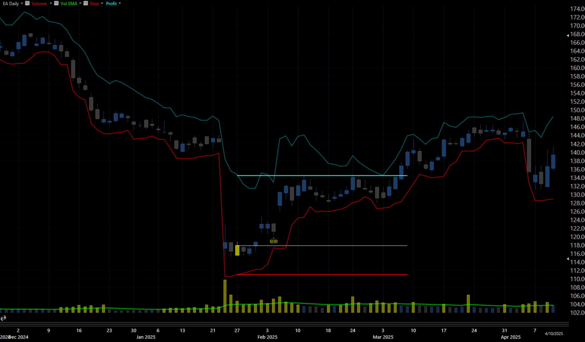
Figure 8.1.A – Updated 2020021 system combination on EA, January 27th, 2025 entry – closed by hitting the profit target.
This chart displays the setup of entry and exit targets. The yellow candle marks the day the trading signal was triggered. A gray line from this candle indicates the entry price, or the price at which the stock was bought. Horizontal teal and red lines extending from the entry point show the profit target and initial stop level, reaching until the position is closed. This example demonstrates how well the setup worked, as the profit target acted as a resistance level that was broken and then turned into a support level, indicating that the level was a significant target watched by many traders. We could suggest that the level might be set slightly lower to close almost a month earlier, before it had to retest this level twice ahead of a potential breakdown that could continue holding. However, the idea is different; this system definitely needs refinement and individual trader adjustments, but we can already see how it traces the extremes to maximize profit potential. Please remember, none of these systems are suitable for trading without thorough research on real data, as historical data only shows profitability up to the end of the sample.
Figure 8.1.B – Updated 2020021 system combination on MCD, January 9th, 10th, 18th, 20th 2025 potential entries – closed by hitting the stop targets.
You should already realize that I prefer to show both sides of the system to illustrate that even these systems can incur losing trades. I included McDonald’s Corp stock, which I find quite volatile, and it recorded four losing positions just in June 2025. This particular example could be omitted by adding a condition for a long-term uptrend, but doing so might introduce new challenges requiring comprehensive re-testing. Altogether, these positions could lead to a loss of about 400% of the initial risk percentage we set through the stop targets. This highlights the importance of predefining and accurately calculating this level to account for potential drawdowns. Many other stocks also experienced similar downturns during this period, making such drawdowns inevitable. To protect our portfolio, we must be prepared for these scenarios by setting appropriate targets and adhering to them consistently.
What’s Next?
As I complete the third post in this series, I want to share that I am beginning work on a new library that I will expand over time. This library will clarify various indicators and explain how I use them, especially since I’ve noticed that not everyone understands their significance, and some are curious about how to test them on their own. I truly appreciate your interest! Therefore, I am creating this library to address these questions for my readers.
If you’re interested in exploring any of the remaining 2,179 back-tested combinations, you’ll find a comprehensive summary file of all results, individual trade files for each configuration, and a more detailed breakdown of additional parameters categorizing these combinations.
All these options are available for purchasable download below. Whether you’re looking for short-term setups, high batting averages, or strong long-term systems, there’s likely something that fits your trading style. To explore this and many other system combinations, which may have even better historical performance from a pool of 2,180 samples tailored to your trading approach, you can access individual files for each combination along with a summary of all system performances below.
— End of Part Two
⚠️ Disclaimer
The content provided in this post is for informational and educational purposes only. It represents my personal research, observations, and experimentation with trading systems, and is not intended as financial advice, investment advice, or a recommendation to buy or sell any securities or financial instruments.
Trading in the financial markets involves significant risk, and you should never invest money you cannot afford to lose. The systems discussed here were tested using historical data under specific assumptions, and past performance is not indicative of future results. Market conditions change, and no strategy can guarantee profits or prevent losses.
While I strive to be as transparent and data-driven as possible, all results, charts, and conclusions are presented as-is and may contain errors, omissions, or inaccuracies. Any decisions to trade based on this content are made entirely at your own risk. I disclaim all liability for any financial loss, damage, or consequences that may result from the use of the information provided here.
Please consult with a licensed financial advisor, legal professional, or risk specialist before engaging in any trading or investment activity.